

The checkout trust signals with the biggest practical payoff are one or two recognized payment logos, a trust badge or short guarantee placed right beside the payment fields, and a total that is fully visible before the buyer enters card details. The placement rule that matters most: keep these cues inside or directly touching the payment area, not buried in a header or footer. Pair that with layout QA and fast A/B tests, and you reduce perceived risk at the exact moment shoppers hesitate.
TL;DR:
- Baymard found that 19% of shoppers had abandoned checkout because they distrusted a site with their card details; a bordered, padded payment panel can address it.
- Show buy now pay later installment amounts and total cost before payment, and give declined payments an inline retry with a clear next step.
- Test one change at a time, starting with total visibility; judge variants by checkout completion, approval, and error rates, not clicks.
- Check scripts and layout after updates because third party changes can shift mobile fields; PCI rules require script monitoring and payment page integrity checks.
- The FTC’s rule bans fake reviews; show verified purchase reviews and disclose incentives beside them without editing testimonials to change customers’ meaning.
Table of Contents
- Types of Checkout Trust Signals and What Each One Communicates
- Placement and Visual Design Rules for Trust Signals at Checkout
- How Payment Method Order and Presentation Shape Trust
- Microcopy, Transparency, and the Rules Behind Reviews
- A 30/60/90 Plan to Implement and Test Trust Signals
- Implementing Trusted Checkout Flows on One Platform
- Three Priorities for Teams Optimizing Checkout Trust
- Run Your Checkout Experiments Without Rebuilding Everything
- FAQ
- Sources
Types of Checkout Trust Signals and What Each One Communicates
Shoppers run a quick mental checklist before they hand over a card number: is this site legitimate, is my data safe, will I get what I paid for, and has anyone else done this safely? Different trust signals answer different parts of that checklist, so stacking the wrong ones in the wrong place wastes space without lowering anxiety.
Security indicators (padlocks, SSL badges, payment logos) answer the "is my data safe" question and belong closest to the card fields. Business legitimacy cues (a real address, a support phone number, clear legal terms) answer "is this a real company," and they can live in the footer or an order summary without losing impact. Social proof (reviews, ratings, customer counts) answers "has this worked for someone like me," while guarantees and return policies answer "what happens if this goes wrong."
Some signals are purely visual and take seconds to add, as explained in our guide on how to build trust online. Others require actual content work: a refund policy, a privacy statement, a working contact page. A padlock icon with no real security behind it is decoration. A visible, specific guarantee backed by an actual policy page is a functional trust cue, and interface design research on trust finds that cues tied to real functionality outperform purely decorative ones.
For the payment step specifically, prioritize in this order:
- Recognized payment method logos (cards, major digital wallets) positioned next to the submit button.
- A single trust badge or security seal placed inside or touching the payment card, not isolated in a footer.
- A short, specific guarantee line ("30-day refund, no questions") near the total.
- A visible total that includes taxes and fees before the buyer clicks to pay.
- Light social proof (a rating or review count) above the fold if space allows, since it carries less weight at this exact step than security and pricing clarity.
Everything else, including extended testimonials, detailed about-us content, and press mentions, belongs earlier in the funnel. At checkout, the job is reassurance, not persuasion.
Placement and Visual Design Rules for Trust Signals at Checkout
Where you put a trust signal matters more than how many you add. Baymard's checkout research found that visual cues and encapsulation near the payment fields raise perceived security, and that 19% of shoppers had abandoned a checkout in the prior three months specifically because they did not trust the site with their card information. A badge sitting in a page footer, away from where the buyer is actually typing a card number, does little to reduce that specific fear.
- Encapsulate the payment area with a background panel, a visible border, and enough padding that it reads as a distinct, contained zone rather than part of the general page layout.
- Place one or two badges inside or directly beside that encapsulated area, never only in the header or footer where the buyer has already stopped looking by the time they reach the card fields.
- Use a subtle shadow or elevation effect on the payment card to make it feel separated and deliberate, not an afterthought bolted onto the page.
- On mobile, stack payment method icons horizontally just above the pay button, or use a single compact badge inside the payment card itself since screen space is limited.
- Keep the total number of visual elements low. Three well-placed cues beat eight scattered ones, and clutter near the payment fields reads as noise, not safety.
- QA every breakpoint. A badge that renders perfectly on desktop but overlaps the card number field on a phone destroys more trust than it builds.
Pro Tip: Test your payment page after any third-party script update, since a single new tag can shift layout just enough to break encapsulation on mobile without anyone noticing until conversions drop.
Third-party scripts for analytics, chat widgets, or marketing pixels are a common source of these breaks. Each one adds render weight and a chance of shifting your payment card out of alignment, so treat every new script addition as a layout risk worth testing before it goes live, not after.
How Payment Method Order and Presentation Shape Trust
The order you present payment options in is itself a trust signal. Shoppers read the first option as the one you recommend or the one most people use, so lead with the method that has the broadest recognition and the fastest approval path for your customer base, then list alternatives below it.
- Put the most widely recognized and quickest-approving payment methods first, with concise labels rather than generic terms like "other."
- Add one short line of supporting copy per method only when it clarifies something non-obvious, such as processing time or eligibility.
- Surface buy-now-pay-later or subscription terms before the final click, showing the per-installment amount and total cost so there is no surprise on the next statement.
- Build a clear fallback path for declines: an inline retry option, a plain-language reason when possible, and a next step that does not force the buyer to start the checkout over from scratch.
Showing the grand total, including shipping and tax, before the buyer commits to paying is one of the simplest and most effective trust signals available. Baymard's work on cart abandonment frames unclear costs and surprise charges as a direct driver of distrust, on par with weak security cues. A shopper who sees the full number early assumes you have nothing to hide. One who finds a new line item after entering their card details assumes the opposite, even if the charge is legitimate.
Microcopy, Transparency, and the Rules Behind Reviews
The words next to your payment fields carry as much weight as the badges around them. Short, factual microcopy beats vague reassurance every time.
- "We don't store your full card number" is specific and checkable; "Your data is safe with us" is not.
- "Refunds processed within 5 business days" sets a concrete expectation instead of a generic promise.
- "Your card is charged once, today" removes ambiguity around subscriptions and recurring billing.
Behind that language sits a harder requirement: the payment page itself has to be secure, not just described as secure. PCI SSC guidance on payment page security recommends reducing third-party script exposure and monitoring payment page integrity to prevent e-skimming, where attackers inject code into a checkout page to capture card data in real time. PCI DSS v4.0 requirements 6.4.3 and 11.6.1 specifically call for monitoring and controlling scripts that run on payment pages, which makes script discipline an operational trust factor, not just a design choice.
One compliance note matters for anything that looks like social proof. The FTC's final rule on consumer reviews and testimonials bans buying or selling fake reviews and carries civil penalties for knowing violations. If you collect or display reviews, disclose any incentive clearly and never fabricate or edit a testimonial to misrepresent what a customer actually said. A safe pattern: show verified buyer reviews with purchase confirmation, and if you offer a discount for leaving a review, state that plainly next to the review itself rather than implying it was unprompted.
A 30/60/90 Plan to Implement and Test Trust Signals
Rolling out trust signals works best as a staged plan rather than a one-time redesign. Each phase builds on confirmed wins from the last.
- Weeks 1 to 4: Encapsulate the payment area, add one or two recognized payment logos beside it, and show the full total including tax and shipping before checkout. These are low-risk, high-clarity changes you can ship without a formal test.
- Weeks 4 to 8: Run small A/B tests on badge placement, guarantee wording, and payment method order. Track checkout completion rate, payment approval rate, and error rate as your primary metrics, not clicks or time on page.
- Weeks 8 to 12: Scale the winning variants to all traffic, then add a monitoring layer that flags unexpected script changes or layout regressions on the payment page going forward.
Each test needs a clear hypothesis and a single changed variable. Testing a new badge and new copy at the same time tells you nothing about which one moved the number.
Pro Tip: Run your first test on the total-visibility change before anything else. It is the cheapest to implement and the easiest to measure against completion rate.
Build a short QA checklist you repeat before and after every deploy: payment card renders correctly at three breakpoints, no element overlaps the card fields, and no new third-party script has altered page load behavior. When a test wins, roll it out gradually and keep watching approval rates for a week, since a layout change that looks fine visually can still interact badly with a payment script in ways that only show up in decline data.

Implementing Trusted Checkout Flows on One Platform
Every trust signal on this list depends on a payment page that renders the same way for every visitor, every time. The more third-party scripts and separate systems touch that page, the more surface area exists for a layout bug or a script conflict to quietly undercut the badges and copy you worked to get right.
Running checkout, funnel logic, and payment presentation through fewer connected systems reduces that surface area. When the sales funnel, the payment step, and the affiliate tracking that drives traffic to it all sit inside one workflow, testing a badge placement or a payment method order does not require coordinating changes across separate tools that were never designed to talk to each other.
What's worth watching regardless of setup: approval rates after any script or plugin update, layout behavior across breakpoints after a deploy, and whether a failed payment triggers a clear retry path instead of a dead end. Those three checks catch most of the damage before it shows up in a conversion report.
Three Priorities for Teams Optimizing Checkout Trust
If you only have time for three things, start with layout QA and encapsulation. A misaligned badge or a payment card that breaks on one phone model does more damage than any badge you could add fixes.
Second, run small, fast tests aimed at approval and completion rates, not badge collection. Adding a fourth security seal rarely moves the number; fixing a confusing total or a slow-loading payment step usually does.
Third, reduce the number of separate scripts and systems touching your payment page. Fewer moving parts means fewer chances for an update somewhere else to quietly break the trust signals you already built.
— FanBasis
Run Your Checkout Experiments Without Rebuilding Everything
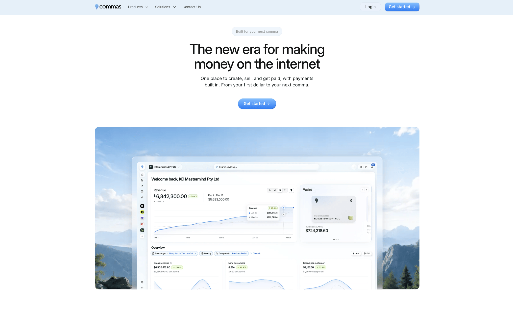
Testing badge placement, payment order, and total visibility gets harder when your checkout, funnel, and analytics live in separate tools that each need their own update cycle. We built our payments and Vibe Funnels builder to sit in the same account, so changing how a payment step looks does not mean touching five different systems and hoping nothing breaks.
| What you're testing | Where it lives in Commas |
|---|---|
| Badge and total placement | Vibe Funnels checkout step |
| Payment method order | Payments |
| Approval and completion tracking | Built-in analytics |
If you are planning a checkout overhaul for an existing offer, request a demo of Commas Payments and walk through your current flow with our team before you rebuild it from scratch.
FAQ
What is trust signaling?
Trust signaling is the use of visual and written cues, such as security badges, payment logos, guarantees, and transparent pricing, to reduce a shopper's perceived risk at the point of purchase. The goal is to answer unspoken questions about safety and legitimacy before they cause hesitation or abandonment.
Why is trust important in online shopping?
Shoppers cannot physically inspect a product or verify a seller before paying, so trust signals substitute for the reassurance a physical store provides. Baymard's checkout research found that 19% of shoppers abandoned a checkout in the prior three months specifically because they distrusted the site with their card details.
What is trust in CRM?
In a CRM context, trust refers to the data and relationship signals a system tracks to show that a customer interaction is legitimate and well-handled, such as verified contact history, consistent communication, and accurate order records. It is a separate concept from checkout trust signals, though both rely on consistency and transparency with the customer.
What are trust badges?
Trust badges are small visual seals, such as security certifications, payment network logos, or guarantee icons, placed near checkout to signal safety and legitimacy. Recognizable third-party seals often perform best, though Baymard's testing found that even homemade security icons can outperform lesser-known third-party badges when placed close to the payment fields.
How do I know if a review or testimonial is compliant to display?
A review is safe to display when it comes from a verified purchase and any incentive for leaving it is clearly disclosed to shoppers. The FTC's final rule on reviews and testimonials bans buying, selling, or fabricating reviews and allows civil penalties for knowing violations.
Sources
- Federal Trade Commission announces final rule banning fake reviews/testimonials
- How users perceive security during the checkout flow – Baymard
- Clover docs: PCI DSS v4.0 requirements 6.4.3 and 11.6.1
- Payment page security and preventing e-skimming – PCI SSC (blog)