
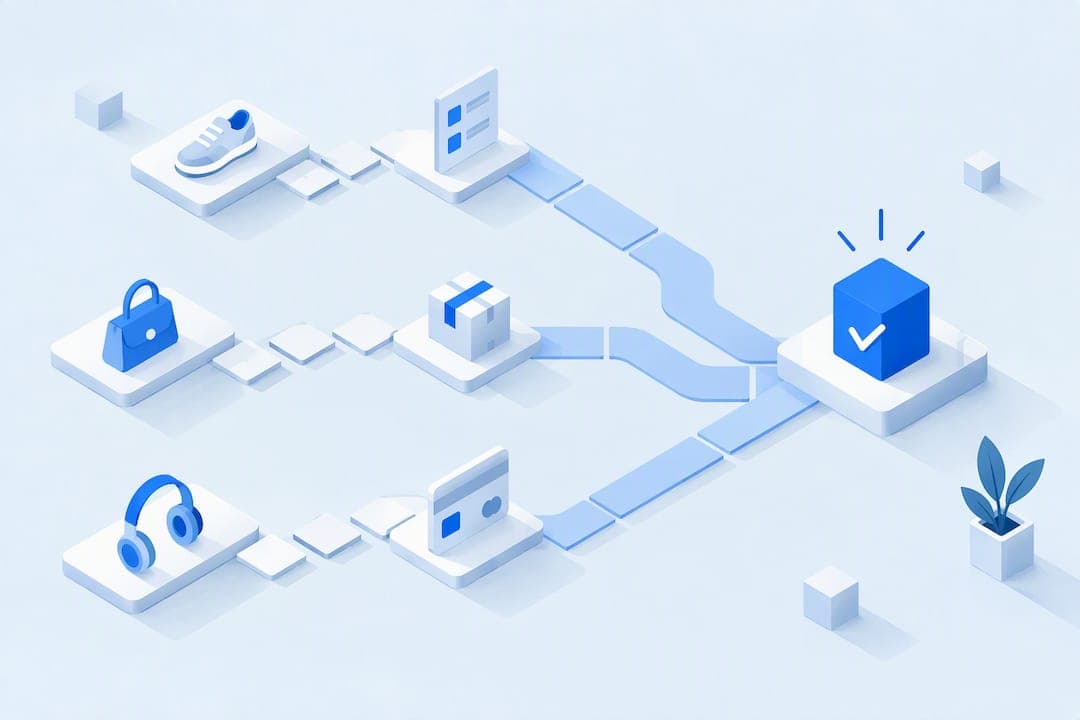
The fixes that move the needle fastest are guest checkout with delayed account creation, fewer visible form fields, full cost shown early, autofill and accelerated checkout options, faster interaction response times, and digital wallets paired with clear trust signals. Baymard Institute finds that roughly 70% of carts are abandoned and 63% of mobile checkouts rate mediocre or worse, while interaction responsiveness under 200 milliseconds keeps payment steps from stalling. Test each change with A/B experiments and real user monitoring before rolling it out broadly.
TL;DR:
- Prioritize enabling guest checkout and hiding unnecessary form fields to reduce barriers for first-time buyers and increase form completion rates.
- Focus on improving interaction responsiveness, aiming for under 200 milliseconds delay on payment taps, as delays directly impact conversion rates and revenue.
- Show the full cost, including taxes and shipping, early in the process and clearly label the final CTA to avoid surprises that cause abandonment.
- Place digital wallets above manual entry options and prominently display recognizable payment icons to build trust and speed up the checkout flow.
- Measure checkout performance at each step using real user data and run targeted tests, such as guest vs. forced account creation or form layout changes, to identify high-impact improvements.
Table of Contents
- Which mobile checkout fixes should you prioritize first?
- What form-level changes reduce friction and errors?
- How do page speed and responsiveness affect checkout conversions?
- Which payment options and trust signals actually reduce hesitation?
- Where should you show costs, and how should the final CTA work?
- How do you measure whether checkout changes are working?
- How a unified payments and funnel setup speeds up implementation
- How do you handle mobile network variability and offline scenarios?
- What security practices matter most for mobile checkout specifically?
- How do you optimize mobile checkout for accessibility?
- Should you use biometrics and other mobile-specific authentication features?
- How should checkout design adapt to small screens and touch input?
- What reduces input errors on a mobile checkout form?
- Where teams get this wrong, and how to sequence it
- A practical next step for sellers running high-ticket checkouts
- Sources
- FAQ
Which mobile checkout fixes should you prioritize first?
Not every fix deserves equal attention. Some changes take an afternoon and move completion rates immediately, while others need engineering sprints and only pay off at scale. Ranking by impact against effort keeps a small team from burning a quarter on a redesign when three quick wins would have done more.
High impact, low effort:
- Delay account creation. Let people check out as guests and offer account setup after payment; this removes the single biggest gate for first-time buyers. KPI: step-level drop-off at the account screen.
- Prune visible fields. Hide Address Line 2 by default and combine first and last name into one field where your payment logic allows it. KPI: form completion rate.
- Default "shipping equals billing." Pre-check the box and let users uncheck it only when needed. KPI: time to complete checkout.
- Show full cost early. Display tax, shipping, and fees in the cart, not at the final tap. KPI: abandonment at the payment step.
High impact, medium effort:
- Enable autofill and accelerated checkout. Structured input names and accelerated wallet buttons cut typing dramatically. KPI: checkout completion rate.
- Fix interaction responsiveness (INP). Slow taps on the payment button cost sales; treat this as a conversion metric, not just an engineering one. KPI: INP on the payment step.
- Surface digital wallets prominently. Don't bury wallet options in a dropdown; put them above manual card entry. KPI: payment method selection rate.
Medium impact, medium effort:
- Add address autocomplete with manual fallback. Speeds up entry but needs a visible override for atypical addresses.
- Inline validation with preserved input. Prevents the frustration of retyping a card number after one typo.
- Explicit CTA labeling. "Pay and place order" outperforms a bare "Submit" button by removing ambiguity about what happens next.
For the first 30 days, run three tests: guest checkout versus forced account creation, a pruned form against your current baseline, and wallet buttons placed above the fold versus their current position. Forrester's research with PayPal found that 73% of consumers say a streamlined checkout process matters to them, which is a strong signal that these three tests will show measurable movement within a few weeks of traffic.
What form-level changes reduce friction and errors?
Most checkout abandonment happens at the form, not because buyers change their minds but because the form asks too much or breaks in small, aggravating ways. Fixing this is mostly about subtraction and correct input handling rather than a redesign.
- Cut the field count. Hide Address Line 2 behind a link, collapse first and last name into one field when your system supports it, and default the shipping-equals-billing checkbox to checked.
- Add address autocomplete with a visible manual entry link. Baymard's research on automatic address lookup warns that autocomplete without a clear fallback causes abandonment when a suggestion overwrites what someone actually typed, particularly for international or rural addresses.
- Use the right input mode, not just the right input type. For zip codes and card numbers, Baymard's testing on touch keyboard types recommends
inputmodeandpatternattributes overtype="number", since numeric inputs can strip leading zeros on some Android versions. - Turn off autocorrect and autocapitalize on email, card, and address fields so the keyboard stops fighting the buyer's input.
- Validate inline, not on submit. Flag an invalid card number or expired date the moment the field loses focus, not after the buyer taps "Pay" and waits.
- Autoformat card numbers with standard spacing (four digits at a time) so the display matches the physical card, which reduces perceived typing errors.
- Never clear the form on error. Preserve every field the buyer already filled in and move focus directly to the field that needs correction.
Pro Tip: Test your checkout form on a physical Android device with a numeric keyboard set, not just a browser emulator: leading-zero bugs on zip and PIN fields rarely show up in desktop testing.
For developers, the checklist is short: confirm autocomplete attributes are set correctly on every field (name, email, tel, postal-code, cc-number), confirm the numeric keyboard invokes without breaking leading zeros, confirm error states point focus rather than just displaying red text, and confirm that a saved draft survives a browser back-button tap. None of this requires a rebuild. It requires someone to sit with the checkout on a phone and try to break it.
How do page speed and responsiveness affect checkout conversions?
A checkout that loads fast but responds slowly to taps still loses sales. Interaction to Next Paint (INP) measures the delay between a tap and the next visual update, and web.dev sets a good INP threshold at 200 milliseconds or less. On the payment step specifically, a sluggish response to the "Pay" tap reads as a broken button, and buyers do not wait around to find out otherwise.
Real user monitoring (RUM) is the right tool for finding where INP breaks down, because lab tests on a fast office connection rarely reproduce what happens on a congested mobile network. Once RUM flags a slow interaction, replicate it in a lab environment (Chrome DevTools or WebPageTest) to isolate the cause, which is usually heavy JavaScript execution blocking the main thread right when the buyer taps to pay.
Fixes that consistently help:
- Defer third-party scripts (chat widgets, analytics pixels, marketing tags) so they load after the payment form is interactive.
- Minimize main-thread work during the exact moment of the payment tap; that means breaking up long JavaScript tasks rather than running them in one block.
- Preconnect or prefetch the payment endpoint so the network handshake finishes before the buyer taps "Pay."
- Lazy-load anything below the fold, images and fonts included, so the browser prioritizes the interactive checkout elements first.
INP under 200 milliseconds is the target, and the payoff is measurable. One merchant example cited by SpeedCurve's INP guidance saw roughly a 7% sales increase after addressing interaction delays, which suggests INP work belongs on the same priority list as copy and layout changes, not filed under "engineering backlog."
A reasonable cadence is to check INP weekly during active development and monthly once the checkout stabilizes, since a single new script or plugin can quietly regress performance the same week a marketing team pushes a new pixel.
Which payment options and trust signals actually reduce hesitation?
The choice of payment methods and how you present them changes whether a buyer trusts the page enough to finish. Hiding wallet options in a dropdown, or failing to label what happens after a tap, adds hesitation at the exact moment you need confidence.
- Put digital wallets above manual card entry, not folded into a "more options" menu; buyers who already have a wallet saved will finish faster than anyone typing a 16-digit number on a phone keyboard.
- Show recognizable payment icons (card networks, wallet logos) near the payment field so the page visually confirms it accepts what the buyer already uses.
- Label redirects explicitly. If a payment method sends the buyer to another screen, say so directly, for example "Continue to complete payment," rather than letting the jump feel unexpected.
- Keep the payment interface consistent between cart and checkout. Visa's guidance on cart abandonment points to fast-loading, consistent payment experiences across devices as a factor in fewer abandonments, with one case example showing up to 42% fewer daily abandonments when a payment lightbox loaded quickly.
- Preselect the most common payment method for your audience rather than defaulting to a blank state that forces a choice before any information is entered.
- Offer to save the payment method after purchase, but only as an opt-in, never a default.
Security badges and reassurance copy work best placed near the CTA itself, not scattered across the footer where no one reading on a phone will scroll to find them. A single line like "Secure checkout, encrypted payment" next to the "Pay" button does more than a row of five badges buried below it.
Pro Tip: When a payment fails, show the specific reason (insufficient funds, expired card, declined by issuer) instead of a generic error: specific failure messages cut retry abandonment more than any redesign.
Where should you show costs, and how should the final CTA work?
Buyers who reach the payment screen and discover a shipping fee they didn't expect abandon at a far higher rate than buyers who saw that number three steps earlier. Cost transparency is not a nicety, it is a checkout mechanic.
- Show the full total, taxes and shipping included, in the cart itself, before the buyer commits to starting checkout at all.
- Repeat the total on the payment screen so nothing changes unexpectedly between steps.
- Label the CTA explicitly. "Pay and place order" tells the buyer exactly what the tap does; a generic "Submit" or "Continue" does not.
- Make the CTA large, high-contrast, and positioned above where the mobile keyboard appears, so the buyer never has to dismiss the keyboard to find the button.
- Allow inline edits from the review screen. If a buyer wants to change quantity or address, let them do it without leaving the page and losing other entered data.
- Avoid sticky navigation bars that cover the CTA when the keyboard is active. This single layout bug quietly kills conversions on smaller phone screens.
- Keep tap targets large enough for a thumb, generally at least 44 by 44 pixels, so a mistap doesn't send the buyer back a step.
None of this is exotic. It's the difference between a checkout that respects the buyer's attention and one that makes them hunt for the button while holding a keyboard open with one thumb.
How do you measure whether checkout changes are working?
None of the fixes above matter unless you can prove they move revenue, not just anecdotal feedback from the team. A measurement plan needs to track the checkout at the step level, not just as a single conversion rate.
Primary metrics to track:
- Checkout completion rate, measured from "start checkout" to "order complete."
- Step-level drop-off, so you know exactly where buyers leave (shipping, payment, review).
- INP specifically on the payment step, not just as a site-wide average.
- Time to complete checkout, start to finish.
- Revenue per session, which catches whether a completion-rate win actually raised revenue or just shifted who converts.
Instrumentation needs both RUM for real-world INP data and event-based funnel tracking that fires at each checkout milestone: checkout started, payment attempted, order completed. Pair this with server-side revenue tracking so a client-side experiment tool never becomes the only source of truth for what actually got paid.
| Test | What changes | Primary metric | Rollout note |
|---|---|---|---|
| Guest checkout vs. forced account | Account creation timing | Step drop-off | Segment by new vs. returning buyer |
| Pruned form vs. baseline | Field count and layout | Form completion rate | Watch for address errors post-launch |
| Address lookup vs. manual entry | Input method | Time to complete checkout | Confirm fallback link visibility |
| Wallet prominence | Payment method order | Payment method selection rate | Test across iOS and Android separately |
| CTA label variant | Button copy | Checkout completion rate | Run at least two full business cycles |
A practical rollout pattern from Baymard's 2024 checkout research is to build the change behind a feature flag, test it on a subset of mobile traffic, monitor RUM and funnel metrics concurrently, then roll out by region or device once the numbers hold up. Guidance on running structured experiments, including how to think about minimum detectable effect and sample size, is covered well in Baby Love Growth's conversion rate optimization tips, which is worth a read before locking your testing calendar.
How a unified payments and funnel setup speeds up implementation
Testing checkout changes usually means coordinating separate systems for funnels, payments, and analytics, and each handoff adds delay. Commas combines payments, Vibe Funnels, and analytics in one dashboard, which means a field pruning test or a CTA label change happens inside the same system that already processes the payment, without exporting data between tools to see whether it worked.
Some platforms run payments through regulated payment partners and offer funnel builders designed to let a seller adjust checkout layout and test variants without touching separate codebases for the funnel and the payment form. For sellers running webinars or live cohort launches, Commas' webinar checkout keeps the payment experience embedded in the same room as the pitch, which matters when the goal is a consistent payment UX from offer to purchase, the same principle Visa's research points to when it comes to reducing abandonment across devices.
For a seller managing a single high-ticket offer, this mostly means fewer places where a checkout change can break silently between systems.
How do you handle mobile network variability and offline scenarios?
Mobile buyers are not always on strong signal. A checkout that assumes a stable connection loses sales the moment someone's train enters a tunnel mid-payment.
Design for graceful degradation rather than a blank error screen. If a payment request times out, show a clear retry option instead of a generic failure message, and never assume a failed request means a failed charge: duplicate-charge protection matters as much as retry logic. Cache form data locally as the buyer types so a dropped connection doesn't erase ten minutes of address entry.
Keep the checkout's critical path (cart total, payment button, confirmation) lightweight enough to function on a throttled connection. Heavy image carousels or video embeds on the checkout page have no business competing for bandwidth with the payment form itself.
Where possible, detect connection quality and simplify the interface accordingly, deferring non-essential scripts further when bandwidth is constrained. A buyer on a weak signal who successfully completes payment because the page degraded gracefully is a buyer who does not become a support ticket asking why they were charged twice.
What security practices matter most for mobile checkout specifically?
Mobile screens make security cues harder to notice, which means the basics matter more, not less. A checkout that looks legitimate on desktop can feel suspicious on a phone if the layout crowds out the signals that usually reassure buyers.
Always serve the checkout over HTTPS, and never let a payment field render inside anything that looks like it could be a spoofed frame. Tokenize card data rather than passing raw numbers through your own servers, which is standard practice with regulated payment partners and keeps sensitive data out of systems that don't need to see it. Display a brief, specific security line near the payment button rather than a wall of legal text no one will read on a five-inch screen.
Watch for autofill vulnerabilities too: a poorly scoped autocomplete attribute can pull the wrong stored data into the wrong field, which looks like a security lapse even when the underlying system is sound. Testing on real devices catches this kind of mismatch far more reliably than desktop emulation.
How do you optimize mobile checkout for accessibility?
Accessibility on mobile checkout is not a separate initiative from conversion, it is the same work. A buyer using a screen reader, larger text settings, or one hand while holding a bag of groceries all benefit from the same fixes.
Every form field needs a visible, programmatically associated label, not just placeholder text that disappears once someone starts typing. Error messages need to be announced to screen readers the moment they appear, not just displayed visually in red. Color alone should never carry meaning: a red border on an invalid field needs accompanying text, since color-blind buyers won't catch the visual cue alone.
Touch targets need to be large enough for anyone with limited dexterity, and the checkout needs to be fully operable via keyboard navigation for buyers using assistive switches. Contrast ratios on CTA buttons and cost text should meet WCAG AA standards at minimum, since low-contrast gray text on white is a common checkout failure that hurts every buyer reading in bright sunlight, not just those with low vision.
Should you use biometrics and other mobile-specific authentication features?
Phones carry authentication tools that desktop checkouts simply don't have, and skipping them means asking for a typed password when a fingerprint or face scan would do the job in half the time.
Face ID, fingerprint authentication, and device-level wallet confirmation (the prompts that come with Apple Pay or Google Pay) let a returning buyer confirm a purchase without typing anything at all. This matters most for repeat buyers on a subscription or a follow-up purchase, where the friction of re-entering full card details each time is the single biggest reason people abandon a renewal.
Where a saved payment method is offered, pairing it with biometric confirmation rather than a typed CVV re-entry keeps the security bar high without adding typing. The device already handles the authentication layer, so the checkout's job is simply to trigger it at the right moment, generally right when the buyer taps "Pay," not buried behind an extra confirmation screen first.
How should checkout design adapt to small screens and touch input?
A checkout designed at desktop width and then squeezed onto a phone screen almost always breaks somewhere, usually at the exact moment a buyer needs to tap something precisely.
Every interactive element, buttons, checkboxes, dropdown triggers, needs enough space around it that a thumb doesn't accidentally hit the wrong one. Stack form fields vertically rather than forcing a two-column layout that shrinks each input past comfortable typing width. Keep the most important actions (the CTA, the edit link) within thumb reach for one-handed use, which usually means the lower half of the screen rather than the top.
Test the checkout with the keyboard open, since that's the state a buyer is actually in while paying, not the clean screenshot state most design reviews use. A CTA that looks perfectly placed in a static mockup can end up hidden below the keyboard the moment someone starts typing a card number.

What reduces input errors on a mobile checkout form?
Small mistakes, a transposed digit, an autocorrected email address, cost more on mobile than desktop because correcting them means fighting a touch keyboard instead of a physical one.
Autoformat inputs as the buyer types: card numbers with spacing, phone numbers with standard formatting, so the display itself signals whether the entry looks right. Validate email addresses for an obvious typo pattern (a missing "@" or a common domain misspelling) before submission rather than after. Use dropdowns or native date pickers for expiration dates instead of a free-text field that invites format confusion.
Confirm critical fields, especially email address, since that's where an order confirmation and receipt will go. A second, unobtrusive confirmation field or a clear display of what was typed before submission catches most of these errors before they become support tickets.
Where teams get this wrong, and how to sequence it
Start with the changes that need no engineering sprint: delay account creation, prune the field list, default the shipping-equals-billing checkbox. These take days, not months, and the data starts telling you something immediately. Once those are live, move to INP and performance work, since that requires more coordination with engineering but tends to have the second-largest payoff. Save address lookup integration and payment method orchestration for last: they're valuable but they're also where the most subtle bugs hide.
The recurring mistakes are predictable. Teams remove error messages entirely instead of improving them, thinking less text means less friction. They ship autofill on half the fields and not the other half, which confuses browsers more than helpful defaults would. They send buyers to a payment redirect with no label explaining what's happening. They clear the entire form the moment one field fails validation.
A cross-functional checklist helps: a product owner to prioritize, a frontend developer to implement, someone from payments to confirm compliance, QA to test on real devices, and analytics to confirm the instrumentation actually fires before the test goes live.
— FanBasis
A practical next step for sellers running high-ticket checkouts
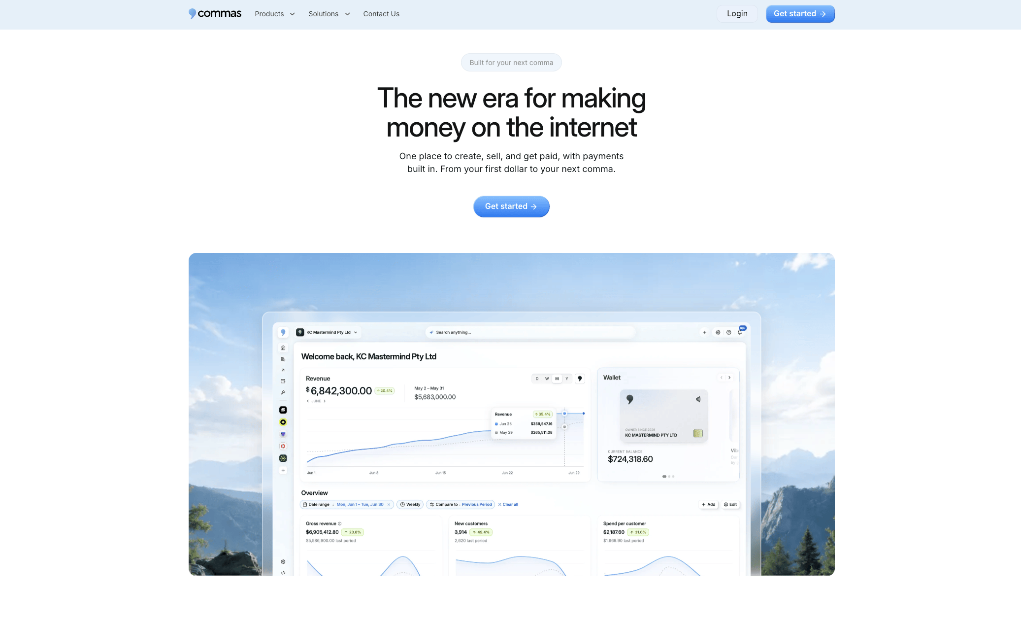
If you're selling a $1,000 to $10,000 offer through webinars, courses, or a paid community, the checkout fixes above matter more per transaction than they do for a $20 impulse buy. Commas brings payments, Vibe Funnels, and analytics into one dashboard, so testing a pruned form or a new CTA label doesn't require stitching together a funnel tool, a separate payment processor, and a third analytics platform just to see whether the change worked.
Relevant areas to look at directly:
- Commas Payments for consistent payment UX across your funnel.
- Vibe Funnels for building and testing checkout variants without a developer for every change.
- Commas Studios for building out the surrounding course, community, or webinar experience around the checkout.
- Qualifier for pre-qualifying buyers on higher-ticket offers before they reach checkout at all.
Request a demo to see how the pieces fit together for your specific offer.
Sources
- Current state of checkout UX - Baymard
- Check Core Web Vitals: INP and how to fix it - SpeedCurve / web.dev
- The future of checkout experiences (accelerated checkout) - Forrester / PayPal
- 5 keys to help avoid cart abandonment - Visa
FAQ
What is checkout optimization?
Checkout optimization means removing friction from the steps between "add to cart" and "order complete" so more buyers finish their purchase. It covers form design, page speed, payment options, and trust signals, and it's typically measured through step-level drop-off and completion rate rather than a single conversion number.
How does mobile checkout work?
A mobile checkout collects shipping, contact, and payment information through a form sized and structured for a phone screen, often supplemented by digital wallets or saved payment methods to reduce typing. The best versions minimize fields, load fast, and respond to taps in under 200 milliseconds to avoid feeling broken.
What is the 3-step checkout process?
A common pattern breaks checkout into three stages: shipping and contact information, payment method selection, and order review before final confirmation. Many high-performing checkouts compress this further using guest checkout and autofill, since Baymard's research finds that most mobile checkouts still rate mediocre or worse on usability, largely due to unnecessary steps.
How do I speed up my checkout?
Start by cutting visible form fields, enabling autofill and digital wallets, and showing full cost early so buyers don't stall at the payment step. Then address technical responsiveness, since interaction delays over 200 milliseconds on the payment button have been tied to measurable revenue loss in merchant case studies.
What payment methods should a mobile checkout offer?
Offer digital wallets alongside standard card entry, and place wallet buttons above manual entry rather than in a secondary menu. Visa's guidance also recommends keeping the payment experience consistent across devices, since inconsistency and slow-loading payment screens are linked to higher abandonment.