

A course completion rate is the share of learners who finish a course divided by a denominator you choose: enrolled, started, or active. The single highest-leverage check is picking that denominator correctly, since "enrolled" versus "started" can swing your reported rate by a wide margin. Before comparing against any benchmark, look at first-week active learners and module-1 completion. That single number tells you more about where you stand than the headline completion figure ever will.
TL;DR:
- Keep the denominator fixed across comparisons: enrolled includes signups who never logged in, while started and active count progressively narrower groups.
- Track first week activity and module one completion before relying on the headline rate, then use a drop off heatmap to locate trouble spots.
- Match interventions to dropout stage: onboarding and quick wins target learners who never start, while skills support and flexible assessments help late stage failures.
- Separate paid certificate learners from free audit learners because research across more than 70 Coursera courses found certificate effects persisted until learners met grade requirements.
Table of Contents
- How to calculate completion rate and realistic benchmarks
- Key metrics to include in a completion dashboard
- Stage-specific risk factors and matched interventions (not initiated → abandoned → failed)
- How to build and interpret a completion dashboard
- Evidence-backed tactics to improve completion rates
- Simple experiment template and reporting table to validate interventions
- Why measurement beats guesswork
- An integrated option for teams who want faster experiments
- FAQ
- Sources
How to calculate completion rate and realistic benchmarks
The basic formula is simple: completions divided by a denominator, multiplied by 100. The denominator is where most teams get it wrong. "Enrolled" counts everyone who signed up, including people who never logged in. "Started" counts only those who opened at least one lesson. "Active" narrows further, to learners who engaged in the last week or month. Each choice produces a different number from the same underlying data, and comparing your rate to a benchmark calculated on a different denominator is a common reporting mistake that makes courses look worse or better than they are.
Benchmarks vary widely by course type:
- Free MOOCs tend to post the lowest completion rates, often in the single digits to low double digits, with shorter and more interactive programs performing better.
- Paid, self-paced courses typically land higher than free MOOCs because payment itself filters for committed learners.
- Cohorted bootcamps with fixed start dates and live instruction tend to post the strongest completion numbers among the formats above.
- Microcredentials and corporate training programs vary by mandate: voluntary programs lag mandatory ones significantly.
Before you benchmark anything, confirm which denominator your own reporting uses, then hold it constant across every comparison you run. Switching denominators mid-stream is the fastest way to misread a real trend as noise, or noise as a real trend.
Key metrics to include in a completion dashboard
Raw completion rate hides the reasons learners leave. A useful dashboard layers in metrics that explain the "why" behind the number.
- Module completion and drop-off heatmap: shows exactly which lesson or unit loses the most learners, so fixes target the right spot.
- First-week active users: the strongest early predictor of eventual completion, since learners who never activate rarely return later.
- Time-to-completion distribution: flags whether most finishers cluster near the deadline (procrastination-driven) or spread evenly (pacing-driven).
- Cohort and acquisition-source segmentation: separates learners by signup channel, campaign, or start date to reveal which sources bring committed learners versus tire-kickers.
- Re-enrollment and certification rates: tracks whether finishers come back for more, a proxy for satisfaction that completion rate alone cannot capture.
Segmenting by payment option or certificate type deserves its own cut. Research on paying for online course certificates found that certificate and sunk-cost effects raised engagement noticeably across more than 70 Coursera courses, with the sunk-cost boost fading quickly while the certificate effect persisted until the grade requirement was met. If your dashboard does not separate paid-certificate learners from free-audit learners, you are averaging two different behavioral populations into one misleading number.
Stage-specific risk factors and matched interventions (not initiated → abandoned → failed)
A single completion percentage flattens three very different problems into one metric. A study of stage-specific completion risk in open higher education distance learning found that the predictors of non-completion change depending on where a learner drops off, and that countermeasures should be matched to each stage rather than applied uniformly.
- Not initiated: low motivation and lack of time predict learners who enroll but never open the course.
- Abandoned mid-course: life situation and an inappropriate completion method (the wrong pacing or format for that learner) predict mid-stream drop-off.
- Failed after submission: difficulty and material availability predict learners who finish the work but do not pass or complete formally.
Each stage calls for a different fix. Early on, onboarding nudges, a small public commitment, and a fast first win reduce the "never started" group. In the middle, scaffolding, check-in messages, and social accountability address the life-situation and format mismatches that cause abandonment. Late-stage failures respond better to targeted skills support, extended access to materials, and alternative assessment formats than to generic encouragement.
Pro Tip: Tag every dropout with the stage it happened at before you design a fix. A single survey question ("what stopped you?") sorted into these three buckets will save months of guessing.
How to build and interpret a completion dashboard
A dashboard earns its keep when it lets you spot a real problem in under a minute, not when it displays the most charts.
Core panels worth building:
- An overview panel with headline completion rate next to segment breakdowns, so no single number stands alone.
- A module-by-module drop-off heatmap, sorted by lesson order.
- A time-to-completion histogram, to separate deadline-driven finishers from steady pacers.
- A funnel view by acquisition source, showing enrolled, started, and completed side by side for each channel.
Filter every panel by signup source, payment type, campaign, start date, and learner profile where that data exists. Segmenting by acquisition source, in particular, often reveals the widest variance in behavior since a webinar audience, a paid-ad audience, and an organic audience rarely complete at the same rate.
A few quick diagnostic rules help you read the dashboard fast, especially by following strategies from How to Improve User Engagement for Lasting Growth. If one module shows a sharp single-point drop while neighboring modules hold steady, the problem is that lesson, not the course. If a cohort lags every other cohort by the same margin throughout, look for a start-date or onboarding issue specific to that group. If completion varies sharply by acquisition source but not by anything else, the fix belongs in your funnel and pre-sell messaging rather than in the course content itself.
Evidence-backed tactics to improve completion rates
A systematic review of dropout in online higher education, covering 110 articles published between 2013 and 2023, identified motivation, course design, technology, and support as the dominant drivers of dropout, with course design and academic preparation flagged as among the most actionable levers available to course teams.
- Chunk content into microlearning units. Shorter modules raise module completion by lowering the commitment needed for each sitting.
- Use certificate incentives deliberately. The certificate effect on engagement persists longer than a simple sunk-cost nudge, so pairing payment with a clear credential path pays off over the course's full length rather than just its opening weeks.
- Build in community and wellbeing supports. A controlled study of a wellbeing-literacy intervention in higher-education online learning reported a substantially higher completion rate in the intervention group compared to control, suggesting pastoral and community supports can be a high-leverage lever, though institutional results should be treated as context-dependent when applied to a commercial course.
- Offer flexible assessment formats. Allowing an alternative submission method for learners who hit late-stage difficulty keeps near-finishers from failing over format mismatch rather than content mastery.
Pro Tip: Pilot one wellbeing or community touchpoint, like a weekly check-in thread, with a single cohort before rolling it out everywhere. Small pilots catch unintended side effects cheaply.
Simple experiment template and reporting table to validate interventions
Before changing anything course-wide, define a hypothesis, a treatment, a sample size large enough to detect a meaningful difference, and a run length tied to your course's typical completion window. Track cohort completion as the primary metric, with module completion and time-to-completion as secondary checks.
A certificate-on-payment versus certificate-on-completion test, for instance, should expect an effect in the range reported in the Coursera research above rather than a dramatic swing.
Report both the absolute and relative lift alongside cohort size, since a small cohort can produce a misleading percentage swing.

Why measurement beats guesswork
Teams that chase a single completion benchmark often fix the wrong problem. Segment first, test small, and let early-week data tell you which stage is actually failing before committing to a redesign.
— FanBasis
An integrated option for teams who want faster experiments
Running the experiments above usually means stitching together a course host, a payment tool, and a separate analytics dashboard, which slows down every test by days. We built Commas Studios to put course delivery, community, and payments in one dashboard, so a certificate-on-payment test or a cohort segmentation check can run without exporting data between three systems.
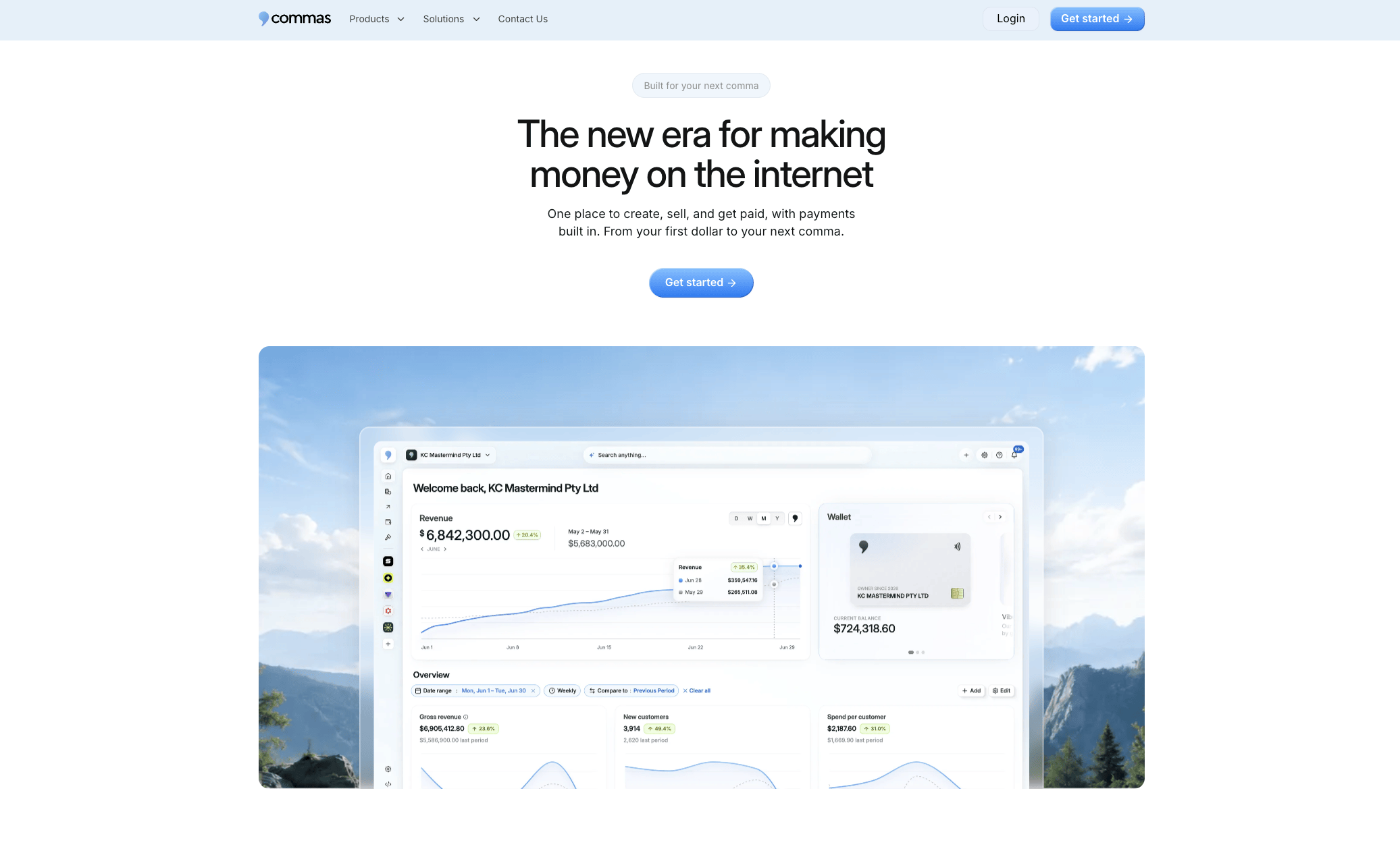
Our Vibe Funnels builder lets you set up acquisition-source variants quickly, so you can see which campaign actually produces finishers instead of just signups. If you are testing payment structure against completion, our Commas Payments setup runs through regulated payment partners and keeps your certificate and billing data in the same view as your completion dashboard. Explore the Commas Studios page to see how course and community tools fit together before you run your next test.
FAQ
How do I calculate completion rate?
Divide the number of learners who completed the course by your chosen denominator, either enrolled, started, or active learners, then multiply by 100. The denominator you pick changes the result significantly, so keep it consistent whenever you compare across courses or time periods.
What are the typical completion rates for online courses?
Rates vary widely by format: free MOOCs tend to sit at the low end, while paid, self-paced, and cohorted courses typically post higher numbers because payment and scheduled start dates filter for more committed learners. There is no single universal benchmark, so compare within the same course type and denominator.
What is a completion rate?
A completion rate is the percentage of learners who finish a course out of a defined starting group, most often enrolled, started, or active learners. It is a ratio, not a fixed standard, and its meaning depends entirely on which denominator was used to calculate it.
What does "course completion" mean?
Course completion generally means a learner finished all required modules, assessments, or milestones defined by the course creator. Definitions vary by platform and course design, so some programs count a passed final assessment as completion while others require every lesson to be marked viewed.
Sources
- Effects of Payment on User Engagement in Online Courses — Ali Goli et al., 2022
- Exploring and counteracting stage specific course completion risk factors in open higher education distance learning — EuroDL Journal, 2024
- Dropout in online higher education: a systematic literature review — International Journal of Educational Technology in Higher Education, 2024
- UWEL Intervention Raises Programme Completion Rates in Higher Education Online Learning — Higher Education Research, 2026