
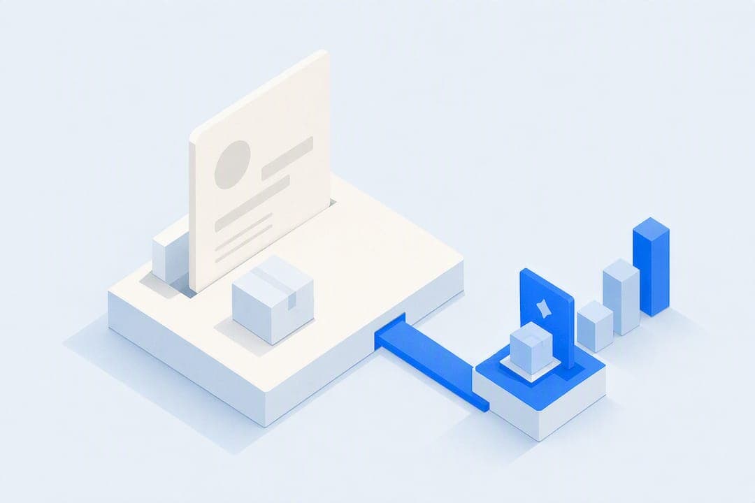
A well-built order bump, one low-friction, relevant add-on shown right before payment, reliably lifts average order value because it monetizes traffic you already paid to acquire. The immediate move: pick one product, attach a single-checkbox add-on priced between $5 and $25, and launch it this week. Then watch two numbers, attachment rate and AOV, for two to three weeks before touching anything else.
TL;DR:
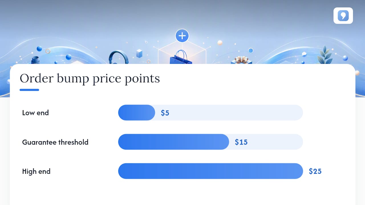
- Order bumps should be priced between $5 and $15 to maximize attachment rates, especially when offering relevant complementary items that require minimal explanation.
- The placement of the order bump right before the payment button in the order summary is critical for ensuring visibility and high conversion.
- An attachment rate of 20% to 40% is typical on well-targeted, frictionless offers, with higher rates demanding more relevant, simple, and low-cost additions.
- Testing should focus on one variable at a time over several weeks, with pricing and placement adjustments based on real data, not assumptions.
- Using platforms that integrate checkout, analytics, and funnel management simplifies tracking and scaling order bump performance across multiple sales channels.
Table of Contents
- What Is an Order Bump Strategy, and How Is It Different From an Upsell?
- High-Converting Order Bump Types and Copy Examples
- How Do You Design an Order Bump That Doesn't Hurt Conversions?
- What's the Real Revenue Math Behind Order Bumps?
- Where Should an Order Bump Sit on the Checkout Page?
- Which Tools Handle Order Bump Implementation Well?
- How Do You Test and Optimize an Order Bump Over Time?
- What Mistakes Kill Order Bump Performance?
- What Psychological Triggers Make an Order Bump Work?
- Are Order Bumps Legal and Ethical to Use?
- How Do Order Bumps Fit Into the Larger Sales Funnel?
- A Practical Checklist Before You Launch Your First Order Bump
- Build Order Bumps Without Stitching Together Five Tools
- Sources
- FAQ
What Is an Order Bump Strategy, and How Is It Different From an Upsell?
An order bump is a single-choice, low-friction add-on presented before the buyer enters payment details, usually as a checkbox or one-tap toggle sitting inside the order summary. The buyer never leaves the checkout page. They see the item, its price, and a one-line reason to add it, and they either check a box or they don't.
That's the entire mechanic, and it's also the whole reason order bumps convert so well: no new page, no new decision tree, no friction.
Compare that to an upsell, which typically happens after the initial purchase decision, either as a higher-ticket alternative offered before checkout ("upgrade to the Pro version for $40 more") or as a post-purchase offer shown on the confirmation page. A cross-sell is closer conceptually, since it's also a complementary suggestion, but cross-sells usually show up earlier in the funnel, on a product page or in a cart drawer, and often require the buyer to add the item and then re-confirm their order. That extra step matters. Every additional click is a chance for the buyer to reconsider the entire purchase.
Here's how the three tactics stack up in practice:
- Order bump: Shown at checkout, one click, low price, low cognitive load, highest conversion rate of the three.
- Cross-sell: Shown earlier in the funnel (product page, cart), requires an added step, moderate conversion.
- Upsell: Shown before or after purchase, higher price point, requires a real decision, lowest conversion rate but highest per-unit revenue when it lands.
Order bumps work best for exactly the situations where a buyer is price-sensitive but the add-on price is trivial relative to the cart, where the extra item obviously belongs with what's already in the cart, and where explaining the offer takes one sentence, not three. If your add-on needs a paragraph of justification, it belongs on the product page, not the checkout.
High-Converting Order Bump Types and Copy Examples
The order bumps that convert share one trait: they eliminate a decision instead of creating one. Below are the categories that consistently perform well across order bump techniques documented across ecommerce platforms, along with the price logic behind each.
-
Practical pairing. A phone case buyer gets offered a screen protector. A coffee bag gets offered a reusable filter. Price band: $3 to $9, because the decision is nearly automatic when the item is genuinely used alongside the main purchase. Copy template: "Add a [item] for $6 — most [main product] buyers grab one too."
-
Digital extras. A printed workbook seller offers the digital PDF version for instant access. A course creator offers a bonus module or a private community add-on. Price band: $9 to $19, since there's no fulfillment cost and the perceived value is high relative to price. Copy template: "Get instant digital access for $12 — no shipping wait."
-
Warranties and guarantees. Extended coverage on electronics or furniture. Price band: $10 to $25, scaled to a percentage of the main item's price (typically 10 to 15%). Copy template: "Protect your purchase for 2 years — just $15."
-
Shipping upgrades. Faster delivery or signature confirmation. Price band: $5 to $15. Copy template: "Get it by Friday — upgrade to express for $8."
-
Micro-memberships. A one-month trial of a paid community or a discount club tied to the purchase. Price band: $5 to $15 for the first period. Copy template: "Join for $1 this month, then $9/month — cancel anytime."
-
Templates and workbooks. Bonus checklists, swipe files, or planning documents that pair with a digital product. Price band: $7 to $19. Copy template: "Add the companion workbook for $9."
The price bands aren't arbitrary. Items under $9 clear the impulse threshold where buyers barely pause. Items in the $10 to $25 zone still convert well, but the copy has to work slightly harder because the buyer registers it as a real decision rather than a reflex. Push much past $25 and attachment rates drop fast, since you're now competing with the psychological weight of the main purchase itself.
How Do You Design an Order Bump That Doesn't Hurt Conversions?
Get the design wrong and an order bump can actually depress checkout completion, since it adds visual clutter and a moment of hesitation right where you need none. Here's the checklist that keeps friction near zero.
Copy structure:
- Lead with the benefit, not the product name: "Never run out of filters" beats "Add: Coffee Filter Pack."
- Add one line of justification, no more: a single reason the item matters right now.
- State price and any discount plainly: "$9 (regularly $14)" reads faster than a sentence explaining the discount.
Offer mechanics:
- Use a checkbox or one-tap toggle only, never a separate page, modal, or "add to cart" flow that leaves checkout.
- Confirm the addition immediately in the visible order summary so the buyer sees their updated total without scrolling.
- Never require re-entering payment details for the bump; it should ride the same transaction as the main purchase.
Visual rules:
- Keep the bump visually distinct (a bordered box or shaded panel) but smaller than the main product listing, so it reads as secondary, not competing.
- Include a small product thumbnail. Buyers process images faster than text, and a thumbnail answers "what exactly am I adding" instantly.
- Microcopy under the checkbox should restate what happens: "Adds $9 to your order today."
Trust signals:
- A short guarantee line ("30-day money-back guarantee") reduces hesitation on anything priced above $15.
- State refund terms plainly if they differ from the main product's policy. Buried fine print here creates support tickets later.
- A tiny social proof line ("Added by 4 out of 10 customers") works when it's true and specific. A vague "customers love this" line does more harm than good, since it reads as filler.
Pro Tip: Test your bump's headline in isolation before you test its price. A weak headline will suppress attachment rate regardless of how good the price is, and you'll waste a testing cycle blaming the wrong variable.
One detail that gets missed constantly: checkout friction is already a major cause of abandonment before you even add a bump, so anything you bolt onto checkout has to earn its place. If cart abandonment is already a problem on your store, fix the core flow first. Adding an order bump to a broken checkout just gives buyers one more thing to be annoyed by on their way out.
What's the Real Revenue Math Behind Order Bumps?
The formula is simple: incremental revenue equals checkouts times attachment rate times bump price. For example, with a moderate attachment rate and bump price, you can add substantial monthly revenue without extra traffic or acquisition spend.
That's the part sellers underweight. Increasing AOV by 10% produces roughly the same revenue effect as increasing traffic by 10%, but without the acquisition cost. An order bump is one of the cheapest levers in the entire funnel because you're not paying for a single extra visitor to pull it.
Here's a fuller worked example. A store doing thousands of checkouts a month at a moderate average order value adds a warranty bump priced in the typical range.
| Metric | Value |
|---|---|
| Monthly checkouts | Several thousand |
| Attachment rate | In the range of 20% to 40% |
| Bump price | Within the $5 to $25 range |
| Incremental revenue | Several thousand dollars per month |
| New AOV (assuming full attach at bump margin) | A few dollars increase per order |
The benchmark to know: attachment rates on well-targeted order bumps commonly land in the 20% to 40% range across vendor and platform data, though your actual number depends heavily on offer relevance and price. Treat 20 to 40% as an optimistic range to validate against, not a guarantee.
Three KPIs matter more than any single number: attachment rate (the percentage of buyers who add the bump), incremental revenue per checkout (total bump revenue divided by total checkouts, which normalizes for traffic changes), and conversion rate delta (whether adding the bump changed how many people finish checkout at all). Track that third metric closely. A bump that lifts AOV but quietly drags conversion down is a net loss even when the attachment rate looks great on a dashboard.
Realistic expectations matter too. Layered AOV tactics, meaning order bumps combined with personalization and smart thresholds, tend to produce single-digit percentage lifts early on, climbing as you optimize copy, price, and placement over several testing cycles.
Where Should an Order Bump Sit on the Checkout Page?
Placement is not a minor detail. It's the difference between a bump that gets seen and one that gets scrolled past.
The order bump belongs inside the order summary, positioned just before the payment method selection, never above the fold competing with the main product listing and never buried below the payment button where nobody scrolls back up to find it. Buyers are in a "confirm and pay" mindset at that point in the flow, which is exactly when a small, relevant add-on registers as a natural extension of what they're already doing rather than an interruption.
Microcopy and call-to-action patterns that reduce confusion share a common structure: name the item, state the price, state the value clearly. Avoid vague CTAs like "Yes, I want this!" that require the buyer to remember what "this" refers to.
Mobile checkout needs its own adjustments:
- Minimize taps to zero beyond the single checkbox tap. Anything requiring a swipe-to-reveal or expand-to-view interaction loses a meaningful share of mobile buyers before they even see the offer.
- Use a sticky order summary so the updated total stays visible as the buyer scrolls, since mobile screens hide the running total far too easily otherwise.
- Test checkbox versus one-tap toggle mechanics separately on mobile. What reads as an obvious checkbox on desktop can feel small and easy to miss on a five-inch screen, and toggle switches sometimes outperform checkboxes purely because they're easier to hit with a thumb.
Which Tools Handle Order Bump Implementation Well?
You've got three broad implementation routes: native checkout features built into your ecommerce platform, third-party apps or plugins layered on top of an existing checkout, or a unified platform where checkout, funnel, and payment logic live in one system from the start. Each route has different failure points worth checking before launch.
Run through this technical checklist regardless of which route you pick:
- Confirm analytics events fire correctly when a bump is added or removed, so attachment rate isn't a guess pulled from revenue math after the fact.
- Verify the bump rides the same transaction as saved payment methods, particularly for returning customers using one-click checkout, since a mismatched payment flow can silently kill the bump entirely.
- Test what happens when a bump charge gets declined separately from the main charge. Some setups fail the entire order instead of gracefully dropping just the bump, which is a checkout bug waiting to tank your conversion rate.
- Check mobile rendering specifically. A bump that looks clean on a desktop preview sometimes overlaps buttons or truncates copy on smaller screens.
Platforms built as a single system, rather than a checkout with plugins bolted on, tend to handle this more cleanly because the bump, the payment processor, and the analytics layer were built to talk to each other from day one. Commas approaches it this way: checkout, one-click add-ons, and funnel attachment all live in the same dashboard, so a bump you build once can attach across multiple funnels without rebuilding the logic each time, and the analytics tracking the attachment rate lives right next to the checkout it's measuring.
How Do You Test and Optimize an Order Bump Over Time?
Treat your first order bump as a draft, not a finished product. The testing cadence that works looks like this:
- Run a baseline for two weeks minimum before changing anything, so you have real attachment-rate and conversion data to compare against.
- Test one variable at a time: price first, then copy, then placement, then whether a second bump helps or hurts. Testing all four at once tells you that something changed, not what caused it.
- Segment before you conclude anything. New customers and returning customers often respond to bumps completely differently, and a $60 cart behaves nothing like a $200 cart when it comes to what feels like a reasonable add-on.
- Size your test window to your traffic. A store doing 50 checkouts a day needs several weeks per test to get a reliable read; a store doing 2,000 a day can often call a result within days.
- Apply decision rules, not gut feel: keep a bump if attachment rate holds steady or rises while conversion rate stays flat or improves; iterate on copy or price if attachment is weak but conversion is unaffected; kill the bump if conversion rate drops at all, regardless of how good the attachment number looks.
Pro Tip: Run your first test on price alone, holding copy and placement fixed. Price is the variable most sellers assume they already know, and it's the one most likely to surprise you, since a $5 bump and a $12 bump on the same item can produce wildly different attachment rates depending on how the buyer perceives value at each threshold.
What Mistakes Kill Order Bump Performance?
Most order bump failures trace back to a handful of repeatable mistakes. Offering more than one or two bumps at once creates decision fatigue, and a buyer who has to evaluate three add-ons often abandons the whole checkout rather than choosing none of them. Irrelevant offerings (a phone case buyer offered a kitchen gadget) get ignored and quietly train buyers to skip past your bumps entirely. Pricing a bump too close to the margin line erodes the profit you're trying to capture, and manufactured urgency ("Only 2 left!") on a digital product with unlimited inventory tends to damage trust once buyers notice it's fake.
- Red flag: attachment rate under 5% after two weeks. Fix: cut to one bump, lower the price, or rewrite the headline around a sharper benefit.
- Red flag: conversion rate drops after adding a bump. Fix: roll it back immediately and re-test placement before touching copy.
- Red flag: high attachment but rising refund requests on the bump item specifically. Fix: the copy is overpromising; tighten it to match reality.
When the add-on genuinely needs explanation, a real decision, or a higher price point, a bundle on the product page or a post-purchase upsell fits better than forcing it into checkout.
What Psychological Triggers Make an Order Bump Work?
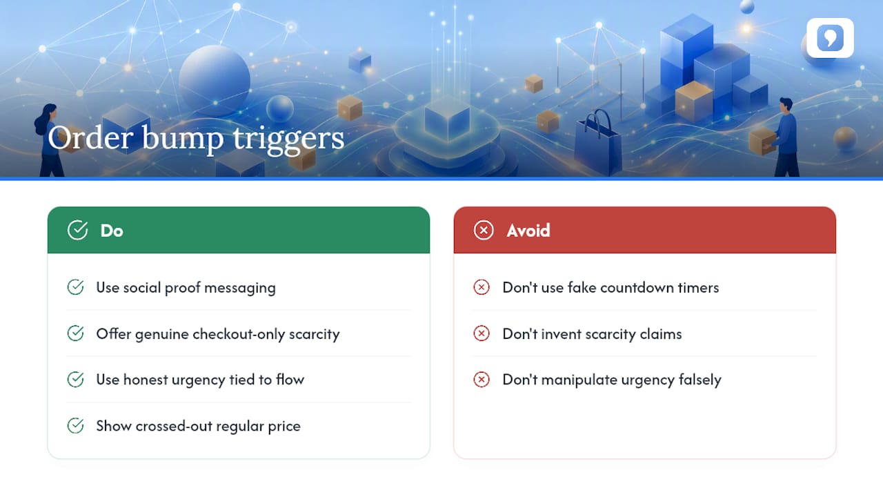
Order bumps succeed by exploiting the same decision shortcuts that drive impulse purchases anywhere else, just compressed into a single checkbox. Social proof ("added by most buyers") works because people default to what others are doing when a decision feels low stakes, and checkout is deliberately a low-stakes moment for a $9 add-on. Scarcity works when it's real: "only available at checkout" is true and creates a legitimate reason to decide now instead of later, since the buyer genuinely can't come back for this offer after the payment page.
Urgency needs more caution. A countdown timer on a $12 add-on can tip into manipulation fast if the urgency isn't tied to anything real, and buyers who feel tricked once tend to distrust every future offer from that store. The honest version of urgency in an order bump is simply that the offer exists at this moment in this flow and won't be repeated, which is already true by design.
The anchoring effect does a lot of quiet work too. Showing a bump's regular price crossed out next to a discounted checkout-only price reframes the decision from "should I spend $12" to "am I getting a deal," and the second framing converts noticeably better because it feels like avoiding a loss rather than making a purchase.
The common thread across all of these: they work when they're true and fail, sometimes permanently, when they're fabricated. A fake countdown or an invented scarcity claim might lift one week's numbers, but it erodes the trust that makes every future offer, bump or otherwise, convert at all.
Are Order Bumps Legal and Ethical to Use?
Order bumps sit inside standard consumer protection expectations that already govern ecommerce checkout everywhere: the price has to be clear before the buyer confirms payment, the add-on can't be pre-checked in a way that charges someone without a clear, affirmative action, and refund or guarantee terms stated in the bump's copy have to match what the store actually honors. Pre-checked boxes that require the buyer to notice and uncheck them to avoid a charge are the single most common compliance problem with order bumps, and several consumer protection frameworks around the world specifically target this kind of default-opt-in dark pattern. The safer standard, regardless of where you sell, is an unchecked box the buyer actively selects.
Ethically, the line is simple even when the legal specifics vary by market: does the buyer clearly understand what they're adding and what it costs before they confirm? A bump that requires a careful read of fine print to understand what's being charged fails that test even if it's technically compliant. Refund terms deserve the same clarity as the main product's terms, not a vaguer version buried in a tooltip.
Given that specifics do vary by jurisdiction and by payment processor's own terms, treat this section as a starting framework, not a substitute for checking your own market's consumer protection rules before launch.
How Do Order Bumps Fit Into the Larger Sales Funnel?
An order bump is one stage in a layered AOV strategy, not a replacement for the rest of it. A useful way to think about the funnel: pre-cart tactics like curated bundles and product recommendations, in-cart tactics like free-shipping threshold bars, checkout-stage tactics like the order bump itself, and post-purchase tactics like a one-click upsell shown on the confirmation page. Each stage catches a different kind of buyer intent, and order bumps sit specifically at the checkout stage because that's the one moment when the buyer has already committed to paying and a small addition feels frictionless rather than like a new decision.
Free-shipping thresholds work best set around 20 to 30% above your current AOV, paired with product suggestions that help buyers close the gap. That's a pre-checkout lever, and it's worth running alongside order bumps rather than instead of them, since they solve different problems: thresholds nudge cart size up before checkout even starts, bumps monetize the moment checkout begins.
The sequencing matters for a small store just getting started. Start with the lowest-effort tactic first, typically a single order bump on your best-selling product, before layering in threshold bars, bundles, or post-purchase upsells. Trying to launch all four simultaneously makes it nearly impossible to know which tactic is actually driving the AOV change you eventually see.
A Practical Checklist Before You Launch Your First Order Bump
Strip away the theory and here's what actually matters in the first week: pick one product with genuine complementary fit, price the add-on between $5 and $15, write a headline under ten words, put it in the order summary right before payment, and measure attachment rate daily for the first two weeks before deciding anything.
The mistake we see repeated most often isn't a bad bump. It's an untested one, launched once, checked twice, and then ignored for six months while the seller assumes it's "working" because nobody complained. An order bump is a living piece of your funnel, and treating it as a set-and-forget feature wastes most of the upside it was capable of delivering.
[Author bio placeholder: credentials and background for FanBasis]
[Proprietary data placeholder: conversion rate improvements observed across implementations]
[Case study placeholder: testimonials and results from users applying this framework]
— FanBasis
Build Order Bumps Without Stitching Together Five Tools
Most order bump setups require duct-taping a checkout app, an analytics plugin, and a separate funnel builder together, hoping they all report the same numbers. Some platforms offer checkout, one-click add-ons, and funnel attachment inside one dashboard, so the bump you configure on one product can attach across every funnel selling it, with attachment rate and revenue tracked alongside offer setup.
That matters most once you're past your first test and into the optimization phase this guide walks through, where segmentation and multi-funnel attachment become the difference between a bump that plateaus and one that keeps compounding. Whether you're selling online courses, running webinars, or selling coaching, the same order bump logic attaches without rebuilding checkout for each product line. Start a trial on Commas and set up your first order bump against a real product this week, then check attachment rate against the benchmarks in this guide two weeks out.
Sources
- Average Order Value: Formula and 7 Ways (2026) - Shopify
- AOV Optimization: Proven Tactics to Raise Average Order Value
FAQ
What's the difference between an order bump and an upsell?
An order bump is a single-click, low-price add-on shown before payment at checkout, while an upsell offers a higher-ticket alternative or addition, often before or after that same purchase decision and usually requiring more deliberation from the buyer.
What is an order bump?
An order bump is a small, relevant add-on, typically priced between $5 and $25, presented as a checkbox or one-tap toggle inside the checkout flow, letting a buyer add it without leaving the payment page.
What are the best strategies for increasing average order value?
The fastest wins come from low-effort tactics first: a well-placed order bump, a free-shipping threshold set 20 to 30% above current AOV, and curated bundles, followed by post-purchase upsells and layered personalization as you scale.
Can Commas run order bumps for me?
Yes. Commas' payments and funnel tools let you attach a one-click order bump to checkout and reuse it across multiple funnels without rebuilding the offer each time.