
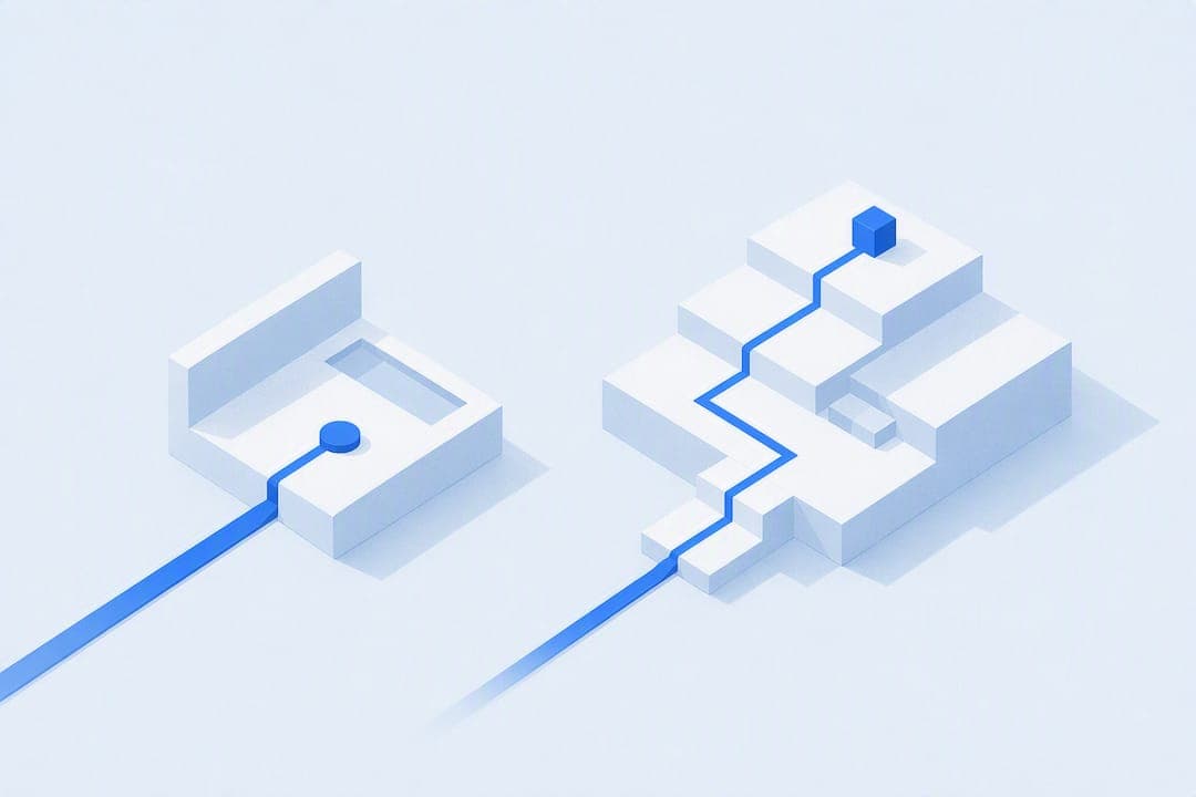
Use a landing page when the ask is small: an email address, a webinar seat, a free trial. Use a sales page when the ask is money. Send cold traffic to a landing page first, then move warm traffic to a sales page for the close. If you're running a PPC campaign, start with a landing page; if you're emailing a warmed-up list, send them straight to a sales page.
TL;DR:
- Cold traffic from ads or search should be directed to a landing page to maximize conversions before sending them to a sales page, especially for mid-range offers.
- Landing pages should be short, focused, and mobile-optimized, with a single clear value proposition, minimal form fields, and trust elements to improve completion rates.
- Sales pages work best for warm traffic, high-priced offers, or when objections need to be addressed with long-form copy, proof, guarantees, and urgency tactics.
- Combining both pages in a funnel reduces acquisition cost by splitting a hard sale into smaller, easier steps, but mixing CTAs can split attention and reduce conversions.
- Testing should prioritize headlines, CTA wording, form length, and proof placement, with mobile speed being critical for overall performance.
Table of Contents
- Landing Page vs Sales Page: What's the Real Difference?
- What Goes Into a High-Converting Landing Page?
- How Do You Build a Sales Page That Actually Sells?
- Landing Page vs Sales Page: A Side-by-Side Breakdown
- When Should You Use a Landing Page vs a Sales Page?
- What Should You Test First to Improve Conversions?
- How Do Landing Pages and Sales Pages Work Together in a Funnel?
- What Marketers Get Wrong About Choosing Between Them
- How Commas Helps You Build Both Page Types Without Juggling Five Tools
- Sources
- FAQ
Landing Page vs Sales Page: What's the Real Difference?
A landing page is a single-goal page built to get one low-commitment action from a visitor: an email, a registration, a click to the next step. Navigation gets stripped out, the offer matches exactly what the ad or search query promised, and everything on the page points at one button. That focus is the whole reason landing pages outperform sending campaign traffic to a homepage or a generic product page, according to the Search Engine Land landing page guide.
A sales page has a different job. It's built to move someone from "interested" to "paid," so it carries a full persuasion structure: the problem, the mechanism behind your solution, proof that it works, the offer itself, and a close. It's longer, denser, and does a lot more convincing per scroll.
Neither should be confused with a homepage (built for brand navigation and multiple audiences) or a standard product page (built for browsing and comparison, usually inside an existing catalog). A landing page and a squeeze page are close cousins. Some marketers use "squeeze page" specifically for a stripped-down, email-only capture page with almost no content besides the form. That's a subset of landing pages, not a separate category.
What Goes Into a High-Converting Landing Page?
Landing pages split into two working types. Lead-gen landing pages collect information: name, email, maybe a phone number, in exchange for a lead magnet, webinar seat, or free trial. Click-through landing pages skip the form entirely and exist to warm someone up before sending them to checkout or a sales page. Ecommerce promos and app download campaigns lean on click-through pages heavily.
Most effective landing pages run short and stick to a tight formula:
- A headline that repeats the exact promise from the ad or search result the visitor clicked
- One clear value proposition, stated in a sentence, not a paragraph
- Three to five bullet points covering benefits, not features
- A single form or button, with nothing else competing for attention
- Trust elements (a logo bar, a testimonial, a security badge) kept brief
Form length matters more than most marketers assume. Every extra field costs you completions. Ask for email only if that's all you need for the next step; add name or phone only if your sales process genuinely requires it before the first follow-up.
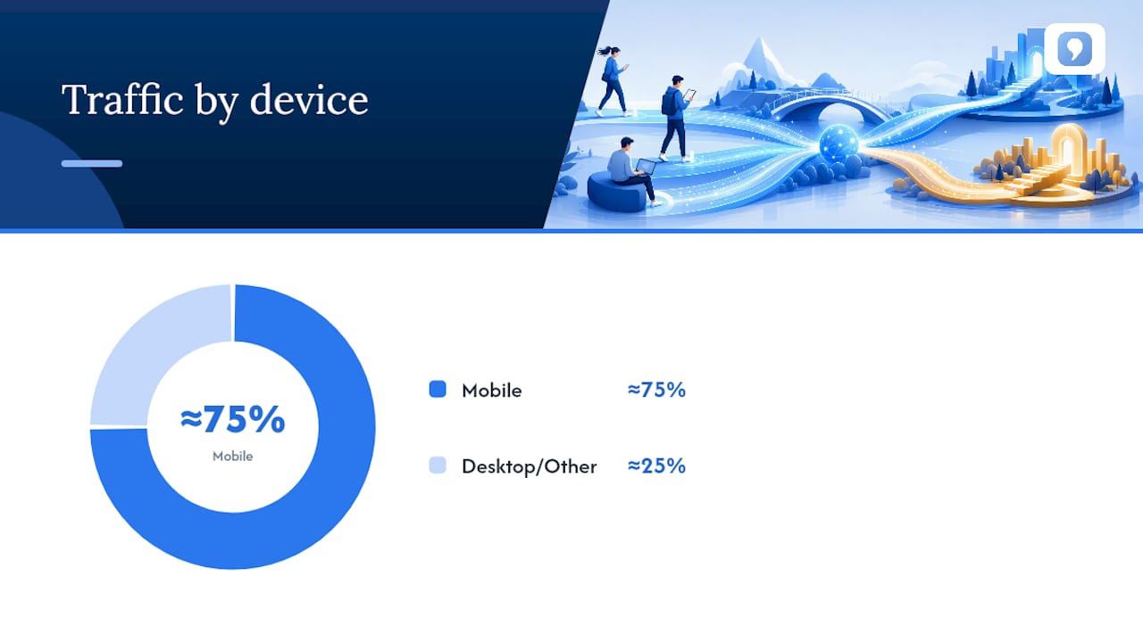
Mobile design isn't optional at this point. Roughly three-quarters of global web traffic now comes from mobile devices, according to Statista, which means a landing page that loads slowly or requires pinch-to-zoom is quietly killing conversions before anyone reads the headline.
How Do You Build a Sales Page That Actually Sells?
Format depends on price and how warm the traffic is. A $30 digital download to a warm email list can convert on a short-form page: headline, three benefit points, price, buy button. A $2,000 coaching program sold to cold traffic almost always needs long-form copy, because the reader arrives with real objections and a long page is where you answer them one by one, according to Rob Palmer's breakdown of sales page structure.
A sales page that's actually built to close tends to run through the same sequence, in roughly this order:
- A headline or hook that names the specific outcome the buyer wants
- Problem agitation, making the cost of inaction concrete
- The mechanism, explaining why your approach works differently than what they've tried
- Proof: testimonials, case results, screenshots, numbers
- The offer itself, laid out clearly with what's included
- A guarantee that removes the financial risk of saying yes
- Urgency or scarcity, when it's genuine
- The CTA, repeated at every natural stopping point on the page
Conversion benchmarks vary widely by traffic temperature. Practitioner-reported ranges put cold-traffic sales page conversion around 1% to 4%, while warm traffic (email subscribers, retargeted visitors, referrals) often lands between 5% and 15%, per Rob Palmer's data on landing page vs sales page performance. If your page is converting well below those ranges for its traffic type, the problem is usually the offer or the proof section, not the headline.
Pro Tip: Don't drop all your proof in one testimonial block near the bottom. Stack a short piece of proof right after each major claim, so skeptical readers get answered in real time instead of having to scroll to "trust me" evidence at the end.
Landing Page vs Sales Page: A Side-by-Side Breakdown
| Factor | Landing Page | Sales Page |
|---|---|---|
| Primary goal | Capture a lead or click | Close a purchase |
| Typical length | brief and focused | generally longer and more detailed |
| CTA type | Low-commitment ask (email, registration) | High-commitment ask (buy, subscribe) |
| Funnel position | Top of funnel, cold traffic | Middle to bottom of funnel, warm traffic |
| Conversion expectations | 50% opt-in in favorable cases | 1–4% cold, 5–15% warm |
You can stack both jobs on one page, and sometimes it works well: a short opt-in offer at the top of a long sales page catches ready buyers who scroll past everything, while the sales copy below still does its job for the skeptics, an approach detailed in ZenWeb's guide to choosing between the two. The danger is running two competing CTAs. If the top asks for an email and the bottom asks for a credit card, you split attention and probably lose both.
Turn this into a decision with four questions:
- Is the traffic cold (ad, search, cold outreach) or warm (email list, retargeting, referral)?
- Is the ask under $50 and low-risk, or over $200 and considered?
- Does the buyer need education before they'll say yes, or do they already understand the offer?
- Do you have proof (testimonials, results, guarantees) ready to deploy at scale?
When Should You Use a Landing Page vs a Sales Page?
Cold traffic from PPC, display ads, or organic search rarely converts to a purchase on the first visit, no matter how good the sales page is. A two-step pattern, landing page capture followed by an email nurture sequence followed by a sales page, typically beats sending that same cold traffic directly to checkout, according to Rob Palmer's funnel analysis. The math is simple: most cold visitors aren't ready to buy on visit one, but a lot of them will give you an email if the ask is small enough.
Retargeting and email traffic are a different animal. These are people who already clicked, opened, or engaged once. Sending them straight to a sales page skips a step they don't need repeated.
A few concrete flows that hold up across industries:
- PPC to webinar funnel: ad click to landing page (webinar registration) to reminder emails to live webinar with a pitch at the end
- Ecommerce flash sale: retargeting ad to sales page (discount + urgency) to checkout, no capture step needed
- SaaS free trial: search ad to landing page (trial signup) to onboarding emails to in-app upgrade prompt
Mid-range offers, roughly $100 to $500, are the hardest to call by instinct. Run both flows against a genuine A/B test rather than guessing. Send half your cold traffic direct to a short sales page and half through a landing page capture, then compare cost per sale, not just cost per lead, over at least a few hundred visitors per variant.
What Should You Test First to Improve Conversions?
Not every test matters equally, and testing the wrong thing wastes weeks. Prioritize in this order:
- Headline — the single highest-leverage element on either page type, since it decides whether anyone reads further
- CTA copy and button placement — small wording changes ("Get My Free Guide" vs "Submit") routinely move conversion rates more than color or size ever will, a point covered in Baby Love Growth's guide to CTA design
- Form length — cut every field that isn't required for the next step
- Proof placement — test moving testimonials earlier on the page rather than only at the bottom
Run every test long enough to reach a real sample size. The Harvard Business Review's refresher on A/B testing flags stopping tests early as one of the most common ways marketers fool themselves. A test that looks like a winner after 40 conversions can flip completely by conversion 200.
Form optimization deserves its own pass. Ask for the minimum at capture, then use progressive profiling, collecting more detail across follow-up emails or a second short form, once someone's already committed. Qualify leads after capture rather than before; a tool like Commas' Qualifier can sort who's ready to buy before a sales call happens, so your team isn't wasting time on unqualified leads.
Measurement differs by page type. Landing pages should be judged on lead quality, not just volume: track how many captured leads actually convert downstream. Sales pages should be judged on revenue per visitor, which accounts for both conversion rate and average order value in one number.
Statistic to watch: with roughly three-quarters of traffic arriving on mobile devices, page speed on mobile isn't a nice-to-have test. It's the test that determines whether any of your other tests even get enough traffic to reach significance.
How Do Landing Pages and Sales Pages Work Together in a Funnel?
Most successful funnels aren't one page. They're a sequence, and the sequence exists for a reason: asking a stranger for money before you've asked for anything smaller usually costs more per sale than it needs to.
The two-step pattern, capture then sell, tends to lower cost per acquisition because it splits one hard ask into two easier ones. A visitor who won't buy a $500 course cold will often trade an email for a free lesson. That email then gets nurtured until the ask feels reasonable.
Direct-to-sales funnels still make sense in specific situations: warm audiences who already know your brand, low-price impulse offers, or flash sales where urgency does the persuading that a nurture sequence would otherwise handle.
A few micro-funnel patterns worth copying:
- Webinar funnel: landing page registration to reminder sequence to live pitch with checkout built into the room
- Ecommerce promo: ad to sales page with countdown timer, no capture step, because the discount itself creates urgency
- SaaS trial: landing page signup to in-product usage nudges to sales page upgrade offer once value is proven
What Marketers Get Wrong About Choosing Between Them
The most common mistake is a mismatch: sending cold traffic straight to a hard sales pitch, or sending warm, ready buyers through an unnecessary capture step that just adds friction. Test in short cycles, watch revenue per visitor and lead quality separately, and let the size of the ask, not habit, decide the page format. Thirty days is enough to know if your funnel order is wrong.
— FanBasis
How Commas Helps You Build Both Page Types Without Juggling Five Tools
If you're tired of stitching together a landing page builder, a separate checkout, an email tool, and a CRM just to run one funnel, that's exactly the gap Commas closes. It puts funnel building, payments, and analytics into one dashboard, so the handoff between "capture the lead" and "close the sale" doesn't depend on three different logins staying in sync.
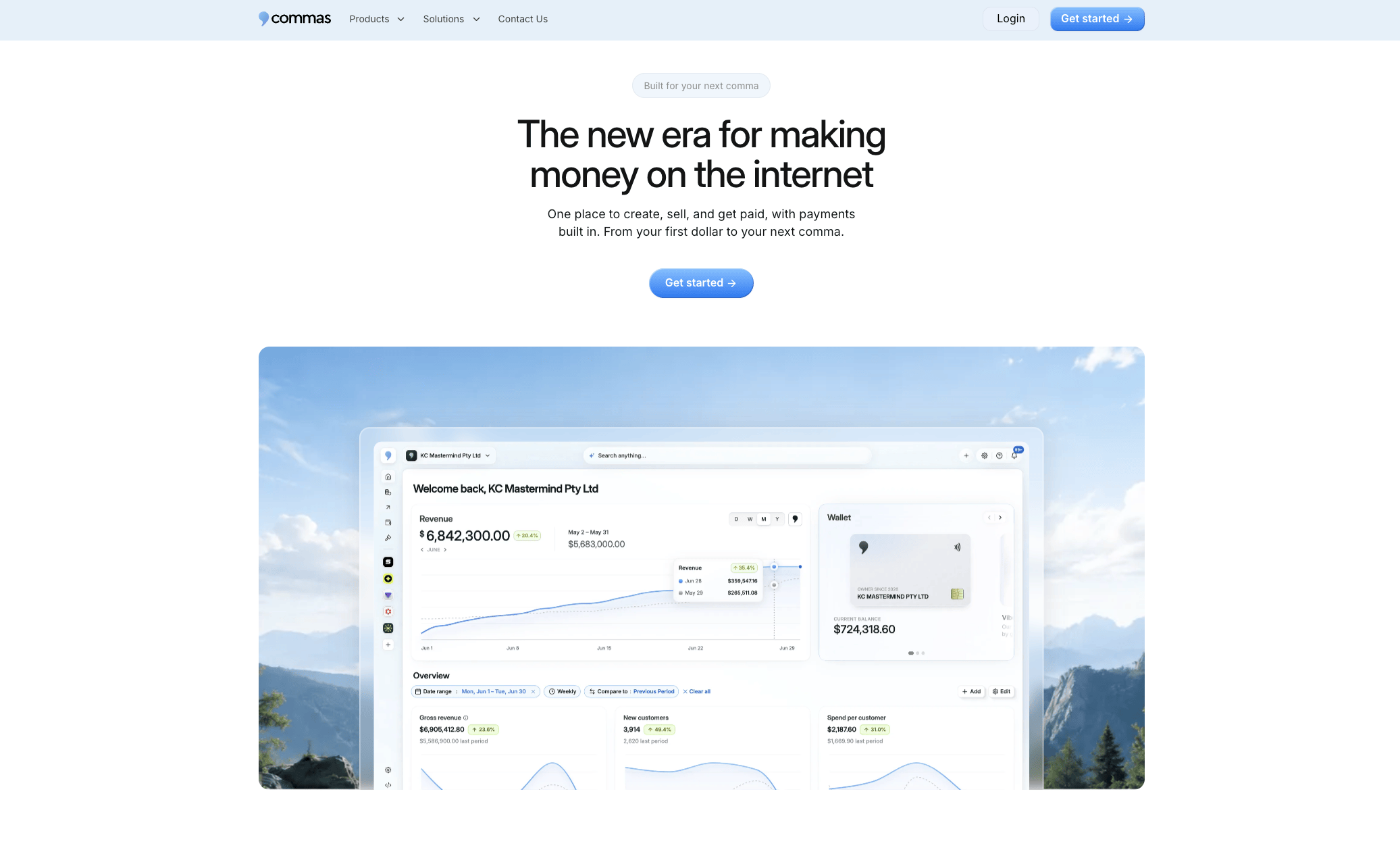
Inside the platform, Vibe Funnels builds landing pages and sales pages using patterns pulled from funnels that already convert, so you're not starting from a blank page for either format. Checkout is built in, supporting one-click payments and installment options right on the sales page, no separate payment processor to configure. Running a webinar funnel is native too: Commas' webinar tool puts checkout inside the room itself, so the pitch and the purchase happen in the same window instead of bouncing viewers to another tab. And once leads start landing from your capture page, Qualifier sorts who's actually ready to buy before your team spends time on a call.
If you're planning your next funnel and want the landing page, the sales page, and the checkout built on one system, start with Commas and build the whole sequence in a single dashboard.
Sources
- Share of website traffic coming from mobile devices | Statista
- A refresher on A/B testing | Harvard Business Review
- Landing page guide | Search Engine Land
FAQ
Are landing pages still relevant in 2026?
Yes. With roughly three-quarters of traffic arriving on mobile and paid ad costs still climbing, a focused, single-goal landing page remains one of the more reliable ways to cut cost per lead, according to Search Engine Land.
Is Canva a landing page?
Canva is a design tool that can help you create the visuals for a landing page, but it's not a landing page platform itself. It doesn't host pages, handle forms, or process payments the way a dedicated funnel tool like Commas does.
What is another name for a landing page?
"Squeeze page" is the closest synonym, typically referring to a stripped-down landing page built purely to capture an email address with minimal content beyond the form.
What is a landing page and what does one look like?
A landing page is a standalone page built around a single call to action, with navigation removed so visitors can't wander off before converting. A typical example: a headline promising a free guide, three bullet points on what's inside, and one form asking only for an email address.
When should I use a sales page instead of a landing page?
Use a sales page when the ask involves money, especially for offers over $100 or for traffic that's already warm, such as an email list or retargeting audience, since sales pages are built to handle objections a landing page has no room for.