

The highest-impact moves are guest checkout by default, trimming visible form fields toward the 8-field range Baymard recommends, surfacing express wallet buttons above the card form, and showing total costs before payment. Together these address the core reasons shoppers bail, and Shopify’s 2026 checkout guide backs each one. Everything else compounds from there; but only if you test sequentially instead of shipping five changes at once.
TL;DR:
Starting with guest checkout and reducing visible form fields to around 8 offers the highest impact with minimal effort.
Displaying trusted payment options and shipping estimates early significantly decreases last-minute abandonment, especially on mobile.
Testing one structural change at a time and tracking detailed funnel metrics is crucial for measuring true impact and avoiding regression.
Integrating payments, funnel management, and analytics into one platform speeds up testing cycles and enhances data-driven decision-making.
Clear, specific error messages for payment declines and retaining entered information reduce failed payment abandonment rates.
Table of Contents
-
How Should You Structure Fields and Validation for Fewer Errors?
-
Where Do Trust Signals and Pricing Transparency Actually Move the Needle?
-
How Do You Find Drop-Off Points and Prove Your Fixes Worked?
-
How Does an Integrated Checkout and Funnel Platform Change the Math?
-
What Do Teams Consistently Get Wrong About Checkout Optimization?
Which Checkout Fixes Should You Prioritize First?
Not every fix deserves equal attention, and treating a low-effort tweak the same as a structural rebuild wastes a sprint. Here’s a ranked list based on typical effort versus expected impact:
-
Default to guest checkout. Low effort, high impact. Forcing account creation is one of the top reasons shoppers abandon carts, according to Shopify’s research.
-
Cut visible form fields to around 8. Medium effort (requires backend field mapping), high impact. Baymard’s testing ties field count directly to completion rates.
-
Add express wallet buttons above the fold. Low effort if you already use a payments processor, high impact on mobile specifically.
-
Show shipping and tax estimates before the final payment step. Low effort, high impact. Hidden costs remain a top abandonment trigger.
-
Turn on inline field validation. Medium effort, medium to high impact. Stops shoppers from discovering an error only after hitting submit.
-
Fix mobile tap targets and keyboard types. Medium effort, medium impact, but it compounds with everything else on mobile traffic.
-
Add a visible progress indicator. Low effort, medium impact on completion psychology.
-
Offer save-for-later or cart persistence across sessions. Medium effort, medium impact for returning shoppers.
-
Improve page load speed at checkout specifically. High effort, high impact, especially on mobile networks.
-
Launch an abandoned-cart recovery sequence. Medium effort, high impact on revenue recovered, not on the completion rate itself.
-
Enable address autocomplete. Low effort, medium impact, particularly for international shipping fields.
-
Support BNPL for higher-ticket items. Medium effort, medium impact concentrated in specific price tiers.
Reported abandonment rates vary widely by industry and traffic source, which is exactly why D2C Times documents merchants seeing significant completion-rate lifts purely from structural checkout changes like collapsing to a single page or moving express payments to the top.
Pro Tip: Ship one structural change per test cycle. If you launch guest checkout, field reduction, and a new wallet button simultaneously, you’ll never know which one moved the needle, and you can’t roll back selectively when something breaks.
How Should You Structure Fields and Validation for Fewer Errors?
Form design is where most checkout abandonment quietly happens, one confusing field at a time. Baymard’s research on checkout flows found the average site asks for far more information than it needs, and every unnecessary field is a fresh chance for a shopper to stall or quit. Aim for roughly 8 visible fields, combining first and last name into one line and using a single address field with autocomplete instead of five separate boxes for street, unit, city, state, and zip.
A few structural habits make the biggest difference:
-
Use address autocomplete so shoppers pick from a dropdown instead of typing every line manually.
-
Match keyboard types to the field: numeric pads for phone and card numbers, email keyboards with the “@” symbol accessible for email fields.
-
Validate inline, as the shopper types or tabs away, rather than dumping every error at once after they hit “place order.”
-
Collapse completed steps (shipping, delivery method) into an editable summary line instead of leaving every field expanded and visible.
That last point matters more than it sounds. Once a shopper finishes a step, showing it as a collapsed, editable line preserves the sense of forward motion, a dynamic HBR’s research on task completion suggests helps people push through to the end rather than abandoning midway.
Defer everything you don’t strictly need for the transaction. Account creation, marketing opt-ins, and profile details can all happen after the purchase completes, when the shopper already has the product and has far less reason to quit.
Pro Tip: Test your checkout form on a real budget Android phone, not just your laptop or an iPhone in a design review. Keyboard behavior and tap-target spacing break in ways desktop testing never catches.

Which Payment Methods Should You Show, and Where?
Express wallets belong above the card entry form, not below it or buried in a dropdown. Stripe’s guidance on checkout optimization notes that surfacing options like Apple Pay, Google Pay, and PayPal at the top of the payment step speeds up checkout specifically because it skips manual card entry entirely, and mobile shoppers benefit disproportionately since typing card numbers on a phone keyboard is where a lot of drop-off happens.
Buy now, pay later options deserve placement logic too, not just a badge. A few rules that hold up across merchants:
-
Show BNPL prominently on higher-ticket items, generally above $75 to $100, where splitting payments changes the purchase decision.
-
Skip BNPL messaging on low-ticket items where it adds clutter without changing behavior.
-
Display the per-installment price near the total, not just as a small badge shoppers have to click to understand.
For returning customers, tokenized and remembered payment methods cut checkout time dramatically since the shopper never re-enters a card number. Stripe’s tokenization approach also keeps you further from handling raw card data directly, which simplifies PCI compliance. If you sell internationally, test authorization routing by region. Localizing payment methods, Klarna or iDEAL in certain markets, for instance, can produce small but compounding authorization-rate gains over time.
Where Do Trust Signals and Pricing Transparency Actually Move the Needle?
Show shipping and tax estimates as early as the cart page, then repeat the full total on the checkout page itself so nothing changes at the last second. Hidden costs discovered right before payment are one of the most reliable ways to lose a sale you’d otherwise closed.
Placement of trust elements matters as much as their presence:
-
Put security badges, accepted payment icons, and a link to your returns policy directly beside the payment button, not in a footer the shopper has already scrolled past.
-
Use contextual social proof near checkout, a simple line like recent purchase counts, where relevant and honest.
-
Add one plain-language sentence about data handling near the card input (“We don’t store your card details”) to address the exact moment perceived risk peaks.
ConvertCart’s testing found that moving trust signals next to the payment control lifted desktop and mobile conversion noticeably. The gap between those two numbers is itself a clue: mobile shoppers are more cautious about payment screens, and reassurance closer to the button matters more on the smaller screen.
How Do You Find Drop-Off Points and Prove Your Fixes Worked?
You can’t fix what you haven’t measured, and checkout is one of the few funnel stages where every step produces a clean, countable event. Track these:
-
Drop-off rate by individual step, not just an aggregate checkout abandonment number. Shipping-info drop-off means something different than payment-step drop-off.
-
Checkout completion rate, the percentage who start checkout and finish it.
-
Authorization rate, how many attempted payments actually clear, which flags processor or routing problems separate from UX issues.
-
Average order value, since some fixes (BNPL, free-shipping thresholds) shift basket size more than raw completion.
-
Recovery conversion rate, the share of abandoned carts that convert after a follow-up message.
For recovery, timing and sequencing both matter. Send the first email within an hour, and consider an SMS within 15 minutes of abandonment for high-value carts where urgency and channel speed pay off. Layer in onsite remarketing and segment offers by cart value, a $40 cart and a $400 cart shouldn’t get the same discount treatment.
When testing, change one variable at a time and avoid running new tests during major sale windows, when traffic behavior skews unpredictably. Give each test enough volume and runtime to reach a real signal before calling a winner, and don’t roll a change out sitewide until you’ve seen it hold across at least one full weekly cycle.
Pro Tip: If your checkout drop-off spikes at the payment step specifically rather than the info steps, check your authorization rate before you touch the design. A UX fix won’t repair a processor routing problem.
What Does a 30/60/90 Rollout Actually Look Like?
Start with an audit, not a redesign. Pull session recordings of real checkout attempts, review funnel metrics by step, check error and authorization logs, and run a speed test on mobile specifically. Break results out by device, since desktop and mobile shoppers often abandon for completely different reasons.
Prioritize using a simple matrix: plot each fix by effort versus expected impact, and tackle high-impact, low-effort items first (guest checkout, express wallets) before moving into higher-effort structural work.
A realistic cadence:
-
Days 1 to 30: audit, then ship the lowest-effort, highest-impact fixes: guest checkout default, field reduction, wallet buttons.
-
Days 31 to 60: one structural change, such as collapsing to a single-page checkout or rebuilding mobile form layout.
-
Days 61 to 90: launch the recovery stack and start localized payment testing if you sell internationally.
When rolling out, isolate each change behind a feature flag or A/B split where possible. Set rollback criteria in advance (a completion-rate drop past a defined threshold) and give every change a full observation window before deciding whether it stays.
How Does an Integrated Checkout and Funnel Platform Change the Math?
Every fix above assumes your checkout, payments, and funnel tools talk to each other cleanly, and for a lot of teams they don’t. Commas combines payment processing, including one-click payments and BNPL, with an AI-assisted funnel builder in a single dashboard, which removes the usual delay of coordinating changes across a separate checkout app, a separate funnel tool, and a separate analytics dashboard.
That matters most in the testing phase described above. Practical capabilities worth knowing about:
-
Integrated one-click payments and tokenized returning-customer checkout, reducing manual card entry.
-
An AI funnel builder (Vibe Funnels) that applies patterns from high-converting funnels automatically, rather than requiring manual A/B setup for every variant.
-
Built-in upsell management and analytics in the same dashboard used for checkout, so drop-off data and funnel performance sit side by side.
-
Affiliate and community tools that extend the same checkout infrastructure into other revenue channels.
Creators using integrated setups like this report meaningful lifts in conversion rate and less time spent stitching tools together, though results vary by store type and traffic mix. This is one implementation path among several, but centralizing payments and funnel logic tends to shorten the gap between spotting a drop-off and shipping a fix.
How Do You Handle Payment Failures Without Losing the Sale?
A declined card doesn’t have to be the end of the transaction, but a vague error message usually makes it feel that way. “Payment failed” tells the shopper nothing they can act on. Specificity fixes this: “Your card was declined by your bank, try a different card or payment method” gives the shopper an immediate next step instead of a dead end.

A few practices reduce failed-payment abandonment specifically:
Keep the shopper’s entered information intact after a failure. Nothing kills momentum faster than re-entering an address because a declined card wiped the whole form. Offer an alternate payment method immediately, ideally one click away, rather than forcing the shopper to start the checkout flow over. If you detect a specific failure reason (insufficient funds, expired card, incorrect CVV), say so rather than defaulting to a generic message, since the fix differs for each.
Log every failure type separately in your analytics so you can distinguish processor issues from user error. A spike in “insufficient funds” declines might point to an audience mismatch, while a spike in generic declines might mean your fraud filters are too aggressive. Route failed transactions through a secondary processor when possible; even a small percentage of recovered authorizations adds up across volume. Treat this as an ongoing tuning process rather than a one-time fix, since decline patterns shift with your customer base and payment mix over time.
What Do Teams Consistently Get Wrong About Checkout Optimization?
Most teams chase the wrong first move. They redesign the entire checkout page before they’ve looked at a single session recording, and they end up fixing problems that weren’t actually costing them sales. Start with the audit, then make one structural change, then measure before you touch anything else.
The bigger mistake is treating checkout optimization like a one-time project instead of a discipline. There’s no single fix that solves abandonment permanently, because your traffic mix, device breakdown, and payment landscape keep shifting under you. Measurement discipline beats any individual tactic on this list, including the ones ranked highest above.
— FanBasis
Get Your Checkout and Funnel Running From One Dashboard
Coordinating a checkout redesign across a payments processor, a separate funnel builder, and a third analytics tool is exactly the kind of friction that slows down the testing cycle this article just walked through. Commas puts integrated payments, an AI funnel builder, and checkout analytics in one account, so a field-count change or a new express wallet button doesn’t require touching three different systems to ship and measure.
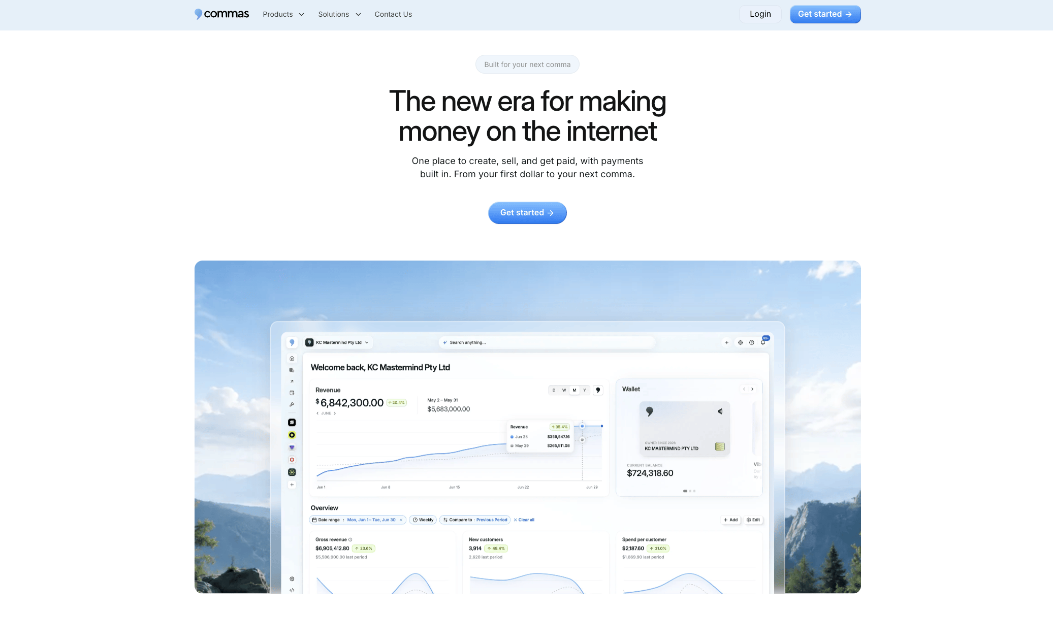
The Payments setup supports one-click checkout and tokenized returning-customer flows out of the box, and Vibe Funnels applies patterns from high-converting funnels automatically when you build or edit a checkout flow, cutting down the manual setup time for each test variant. If you’re planning your next rollout cycle, start a trial and run your first audit inside a dashboard built to test and ship the fixes as fast as you find them.
Sources
-
Checkout optimisation tips for e-commerce businesses – Stripe
-
Ecommerce Checkout Optimization: Complete Guide (2026) - Shopify
-
Analyzing 5 High-Converting Checkout Pages (With a Proven Framework) – ConvertCart